A tel Tale Sign
Brad Frost A tel Tale SignIn this responsive age, it's worth pointing out that mobile phones can make things called "telephone calls." Once upon a time, in an era before web forms and e-mail, the best way to make a dinner reservation, place an order, or get help from customer service was to pick up the phone, dial a number, listen for a few rings and (hopefully) talk to a human on the other end of the line. As it turns out, phone calls are still an amazingly effective (and human!) way to communicate. Yelp mobile users call a local business every other second thanks to prominently-placed phone numbers in their plethora of mobile apps. So yes, these mobile phones we're all carrying around are well-equipped to facilitate some phone call goodness. Here's some other mobile web phone call use cases:
- E-commerce Product Inquiries - I've worked with a lot of e-commerce sites and people do indeed call customer service numbers to guide their purchases. Users often have questions about sizing, fit and quality. When the price is high, it's natural to want reassurance from a human before taking the plunge on a purchase.
- E-commerce Purchases - Many people feel more comfortable going through the actual purchase process over the phone than through an e-commerce site. It's not unusual for a purchase to start on the web and finish over the phone. It also can be more efficient to check out over the phone than stumbling through a mobile checkout form.
- New Business - If you're a web designer, artist, photographer or business, it's likely you have a website to generate new business. Talking over the phone is a more personal way to get to know a potential client before making a commitment, and making a call on a mobile phone can be much easier than clumsily pecking an online web form.
- Calling local businesses - I had a wonderful conversation with the owner of a locksmith company at the airport. Talk about the perfect mobile web use case! If you've locked your keys in your car, you're not going to download an app, you're going to search for a locksmith, call them up and get them there as soon as possible. Hotels, restaurants, bars and many other local businesses can all benefit from an easy to find and use phone number.
- Customer Service - Customer service numbers are intentionally buried by terrible companies (and unintentionally by those who don't know better), but they can be crucial part of a user experience. When a FAQ page isn't enough, or (heaven-forbid) the mobile site doesn't provide the necessary information, users turn toward the customer service number to hopefully get the answers they need.
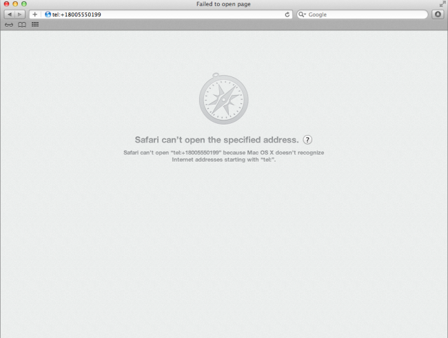
Making Phone Numbers Linkable Max Firtman gives an in-depth look at how to make phone numbers clickable for mobile browsers. The most "standard" way is by using the tel: URI scheme, which looks like this:
Call Customer Service at 1-800-555-0199
This is a great way to bulletproof a phone number, even though most mobile browsers do a decent job auto-detecting phone numbers and converting them into links. iOS, Android, Opera Mini, Opera Mobile, Blackberry (even pre-6.0) all do a good job auto-detecting phone numbers in text and making them clickable. However, most mobile browsers don't stylize these links by default (iOS and Blackberry add an underline to the generated phone links), so it's a good idea to style tel links so they're nice and actionable. [caption id="attachment_2473" align="alignnone" width="650" caption="Chunky, actionable phone number links on Yelp and Google Local"]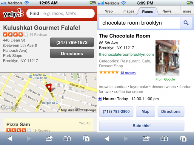

- Make contact information (regardless of context) easy to find - Make it easy for users/potential customers to find your phone number, email address and physical address.
- Global contact info is a good idea - Including contact info in the header or footer of every page makes it easy for users to get in touch no matter what part of the flow they happen to be in.
- Make phone numbers tap-friendly - Don't leave it to the browser to auto-style your phone numbers. Style your phone buttons to be touch-friendly and make it obvious that the numbers are actionable.
- Expose phone numbers and email addresses - A big chunky "Call Us" button might seem like a strong call to action, but it's as generic as "Click Here!" Spell out your phone number to make it dirt simple to read. While you're at it, make sure an email address is exposed as well (I advocate against web-form-only approaches just because I'd rather write you an email in my native email client than a web form). Also, users may just want to copy the text to send to a friend in an email or SMS.
- Don't make phone numbers images - This should go without saying, but...
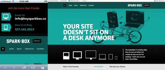
- Redundancy isn't a bad thing - Putting contact information in multiple places makes it easier to find. The fine people at Sparkbox include their contact information 3 times on their homepage without being overbearing.
This post at surface level is quite simple: be mindful of telephone numbers on web pages. But it's really meant to keep up thinking about the mobile context as much more than just a small screen. When we create mobile sites: whether they be dedicated, responsive or other, we should be extremely considerate of all the opportunities and constraints the mobile medium provides.