Adaptive Maps
Brad Frost Adaptive Maps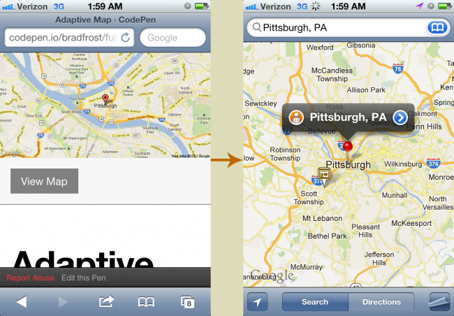
- Cramped screen space - Mobile viewports are small to begin with, so forcing users to interact with a map occupying a fraction of that viewport makes for a cramped experience. Taking users to a fullscreen mapping application makes far more sense.
- Frame Inception - An iframe exists within a page which exists within a browser which exists within the mobile operating system. There's a reason why other modules like videos force open a fullscreen experience rather than making users peck at tiny inline video controls. Perhaps a good rule of thumb is not to go more than three levels deep with regards to experience layers.
- A far superior native experience - Many mobile operating systems (notably iOS and Android) intercept links to Google Maps and open the device's native mapping application instead. The native mapping experience provides far more robust functionality, such as accessing the device's contact list, hardware acceleration, turn-by-turn directions, pinning functionality and more. In addition, the native maps application is easily one of the most used applications on a mobile device, so the user is likely already familiar with the app interface.
- Performance overhead - A lot of extra scripts and images go into making an embedded map work. A core experience should aim to be lightweight, and that extra overhead isn't worth it considering the limited mobile user experience embedded maps ultimately provide.
Adaptive Maps So what are we to do? This is actually a great opportunity to utilize conditional loading to serve the best mapping experience for the right context. A Static Default By default we can simply include a text link to the location on the Google Maps website. And in case a "View Map" text link isn't attractive enough for you, we can also use the Static Maps API to pull in a static image of the location. When a user taps the link, most major mobile platforms will fire up the native maps application where the user can have a richer experience. If the native experience is unavailable, the user is simply taken to the Google Maps website, where they receive a dedicated full-screen mapping experience. Either way, it's a better experience than a cramped embedded map. Detection We can then use Javascript to detect when it's appropriate to introduce the embedded map. After all, embedded maps work quite well when there's enough room to maneuver within them. We can simply replace the default experience with the iframe map when enough screen real estate becomes available. That's really all there is to it. Check it out in action: [caption id="attachment_4948" align="aligncenter" width="1024"]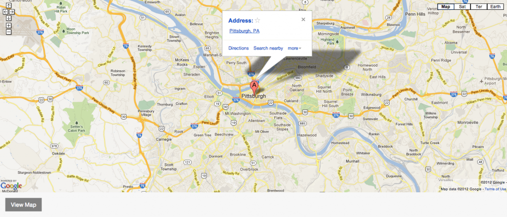
- "But but but that means the user leaves our site!" - I've heard from several people that this approach is undesirable because the user leaves the website. That's the whole point. The user should leave the website and get to your store or to wherever they're trying to go.
- Large screens download an extra map image - This can be easily worked around by defaulting to a text link instead of a static image.
- Managing coordinates in multiple locations - I'm not too well-versed in Google Maps API calls, so I'm not sure if the variables (latitude, longitude, zoom level, etc) are consistent between text links, static map images, and embeddable iframes. Some normalization may be required in order to ensure all the data stays consistent between all the moving parts.
- Complex mapping - This approach works quite well for simple map plotting and even showing groups of locations. However, more interactive mapping requires additional consideration, but even then I'd say that an embedded map still might not make sense. While techniques like adaptive maps might not make sense in every circumstance, it's a decent baseline.
Beyond Layout