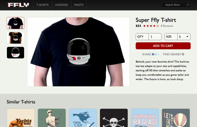
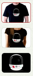
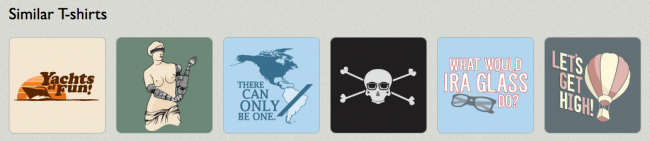
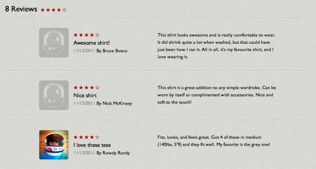
Last month I had the opportunity to contribute to Google's HTML5 Rocks site with an article called Creating a Mobile-First Responsive Web Design. In the article, I walk through step-by-step the process of creating an adaptive website that does its best to take context into consideration. While the tutorial goes over the construction of the experience, this article will take a look at the responsive/UX considerations of the demo. To do this, I've created a feature on the demo that annotates (almost) every element on the page, explaining why the element exists on the page, and also what was considered when incorporating the element into the design. You can toggle annotations by clicking the red area that says "Annotations Off", which is either fixed in the bottom right corner of the demo on larger screens, or below the site footer on smaller screens. So without further ado, I will walk step by step through every element in the demo. Masthead Header The main header of the site doesn't take up too much screen real estate in order to keep the focus on the core content. It's using a linear CSS gradient instead of a background image to give greater design flexibility and reduce HTTP requests. Logo The logo image is purposefully larger and scaled down to the final dimensions. Keeping image file sizes as small as possible is extremely important, but loading in a slightly larger image ensures image crispness on Retina and other high resolution displays. The file size difference is usually negligible and ensures a positive aesthetic first impression. So while you wouldn't necessarily want to do this for every image on the page, it makes sense for something as important as a logo. See also: Optimizing Web Experiences for High Resolution Screens Primary Navigation Navigation for adaptive web experiences can be tricky. Top navigations are typical on desktop sites, but mobile screen sizes don't give us the luxury of space. We're dealing with this situation by creating a simple menu anchor that toggles the main navigation on small screens. This is just one method. Bagcheck and Contents Magazine add an anchor in the header that jumps users to the navigation which is placed in the footer. This solution works well because it doesn't require any Javascript in order to work. Other methods exist too. For example, ESPN's mobile navigation overlays the main content of the page. The nav is only hidden when a certain level of javascript is supported in order to ensure that users with little/poor javascript support can still access the navigation. Once the screen size is large enough to accommodate the nav, we show the main navigation links and hide the menu anchor. See also: Responsive Navigation Patterns Search Box Search is an incredibly important priority, especially for mobile. It is a great idea to give users the ability to jump directly to what they are looking for without forcing them to wade through your site's navigation. Check out the Burton and Yelp mobile sites for great examples of experiences that prioritize search.We're also using the HTML5 search input type, which is great for mobile devices that can bring up the appropriate virtual keyboard for many smartphones. And like the main header navigation, we're hiding the search form on small screens to save space. Clicking the search anchor toggles the form. Image Gallery Image Navigation Instead of providing bullets, pagination or text-based image navigation, it's good e-commerce practice to show a preview of the various product views. By default the images simply link through to their larger counterparts, and if adequate javascript support exists, the images get loaded into the main image container. Product Image The product image is the focal point of the page for good reason. It's typically what the user is there to see. The default markup simply includes the main product image, but that gets replaced with an image gallery if adequate javascript support exists.We're also using Modernizr to detect if the browser supports touch events and if it does, we load in an excellent lightweight script called Swipe.js to create a touch-friendly image carousel. This allows users to swipe between product photos in a touch-friendly way. Because gestures are invisible, they might get overlooked, but clicking on the image navigation thumbnails animates the slideshow and hints to the user gestural interaction is available. Product Description Product Overview The product overview appears in the markup before the image container in order to provide the user with the product name, how much it costs and how popular it is. Providing this information as soon as possible can help the user determine whether or not this is the product they're looking for without having to wait for the rest of the page to load. Rating Stars We're using HTML special characters to display the product rating stars. We're using HTML characters instead of images to reduce the amount of images we're requesting and also maintaining crispness on high resolution screens. Not every device supports HTML special characters (Blackberry <=5.0 for example), but support is strong enough and the benefits are many.See also: Optimizing Web Experiences for High Resolution Screens Review Count This is a simple anchor link that points to the review section of the page. This may seem like a small detail, but consider a mobile use case. Users can be in stores looking at the physical product, and 79% of smartphone consumers use their phones to help with shopping. They might be interested in buying in-store but turn to their phones to verify its popularity and quality. Making it easy for uses to read product reviews on small screens can help drive more sales, both online and offline.While not incorporated yet, it would be easy to load the reviews for small screens on demand, thereby saving an extra click. Quantity Field We're using the HTML5 number input type, which brings up the appropriate virtual keyboard for many mobile browsers. To increase usability, the input labels are using the "for" attribute, which focuses the cursor in the form field when clicked. However, iOS doesn't honor "for" default functionality, so we're adding "cursor: pointer" to the labels to get Mobile Safari to behave properly. Size Dropdown We're using a basic select menu to choose the size, which is commonplace for any e-commerce site. Select menus can be especially difficult to style and can vary greatly in behavior between platforms. Keep this in mind when styling select menus. Add to Cart Button The add to cart button is the primary user action on the page. That's why it's large and in charge and very prominently placed on the page. The button is using box-shadows and rounded corners to create an attractive button that will hopefully get plenty of clicks. Share Button It seems like everything has a share button on it these days. And for good reason. Sharing content and products on social networks can be a great way to increase exposure. However, tacking on tons of social widgets adds a lot of overhead, which can be extremely detrimental to the site's performance. Including a simple share link that loads the heavy widgets only when requested is one way to keep pages fast and social. Check out Target's mobile site for an example of a site that isolates share functionality in a separate page fragment. Auxiliary Information Related Products Related products are obviously an important aspect of e-commerce sites as they drive awareness of other similar products and can lead to more purchases. However, including a lot of auxiliary content can bog down the site performance, which is especially crucial on mobile. On slow connections, the presence of this extra content might slow down the user experience enough that the user gives up.We're handling the issue by conditionally loading the auxiliary content.By default, the related item link simply clicks through to an HTML fragment containing the related products. The content is still accessible, even on devices with poor or no javascript support. When the user clicks on the related products on small screens, the content gets dynamically loaded inline and the link becomes a toggler for the content. Once the experience reaches a certain width breakpoint, we then load in the content. However, screen size != fast connection, so we should keep our eyes on the emerging navigator.connection to better gauge real connection speed.See also: An Ajax-Include Pattern for Modular ContentAll these wonderful t-shirts are retired/rejected Busted Tees, graciously donated to this demo by Will Schneider. Product Reviews Reviews can greatly influence a user's decision to purchase a product or pass on it. Also, because we carry our mobile phones with us everywhere, we use them to inform our in-store purchases. 79% of smartphone owners use their phones to help with shopping, from comparing prices, finding more product info to locating a retailer.Only the primary product content gets loaded by default, and the reviews exist as their own separate HTML fragment. The reviews remain accessible and don't get loaded until we conditionally load them when the screen is large enough or small screen users click the reviews link. This keeps things nimble while still providing access to the valuable reviews.See also: An Ajax-Include Pattern for Modular Content More Reviews Link All reviews aren't loaded by default in order to keep the site performance in top shape. Ultimately, this button could be replaced with a lazy-loading solution to remove the need for the button. Footer Footer Navigation Repetition of elements isn't necessarily a bad thing, especially with potentially long scrolling pages on mobile. Providing access to the main site navigation is a good way for the user to jump off to another section and avoids leaving them at a dead end. Also, some mobile sites like Bagcheck and Contents Magazine keep the primary navigation at the footer and simply link to it with an anchor in the header. That way the nav stays accessible but the focus stays on on the core page content. Customer Service Number We sometimes forget that mobile phones can make phone calls. Whether a user is having trouble with the site or simply has some questions about the product he's about to buy, it's a smart decision to provide a clickable phone number to facilitate that call. What happens when desktops and other non-phone devices click on the tel link? Well, some devices (like iPads and other tablets) ask the user if they'd like to add the number to their contact list, other desktops open 3rd party VoIP programs like Skype, and others simply give an error message. Back to Top Link Back to top links are simple yet underrated. They provide users with an easy way back up to the top of the page with minimum effort. This is especially helpful on mobile devices, which tend to have long scrolling pages.We're using an HTML character for the back to top arrow in order to reduce image elements and keep things looking crisp on high res displays. Wrapping Up So there you have it. Every element of a mobile-first responsive web design explained from a user experience point of view. If you're more interested in reading how the site was built, please read the tutorial on the HTML5 Rocks site. And again, feel free to check out the demo and play with the annotations.
*[DETAILS]: Device, Environment, Time, Activity, Individual, Location, Social