Carousels, image rotators, sliders, featured content modules, whatever the hell you want to call them -- they're everywhere on the web. There's a 95% chance you've created one. But despite being so omnipresent, little is said about our splashy little auto-rotating frenemies. Let's fix that. Last year in the Biodome at Breaking Development Conference, I was discussing (read: screaming about) carousels with Erik Runyon, web developer extraordinaire at Notre Dame University. I lamented the fact that there's no data out there about carousel effectiveness, and Erik clued me in on Notre Dame's homepage, which has not one, but two featured content carousels. What began as a data-filled tweet is now a full-fledged post, which I highly encourage you to check out. So in the spirit of keeping the conversation going, here's my thoughts and considerations around carousels. Carousel Considerations
Make sure you actually need one
Cycle through like items
Make navigation obvious
Only load what you need
Suggest more content to users
Treat touch as an enhancement
Provide gestural hints
Make sure you actually need one I'll go out on a limb and say that most carousels simply don't need to exist. Here's why: Carousels are organizational crutches
INT. MEETING ROOM "I'm very important! I need to be on the homepage!" "I'm also very important! I need to be on the homepage too!" "I'm very very important, I need to be on the homepage three!" "Let's make a carousel! Everybody wins!" THE GROUP HIGH FIVES AND CELEBRATES OVER A BLOOMIN' ONION AT OUTBACK STEAKHOUSE. END SCENE
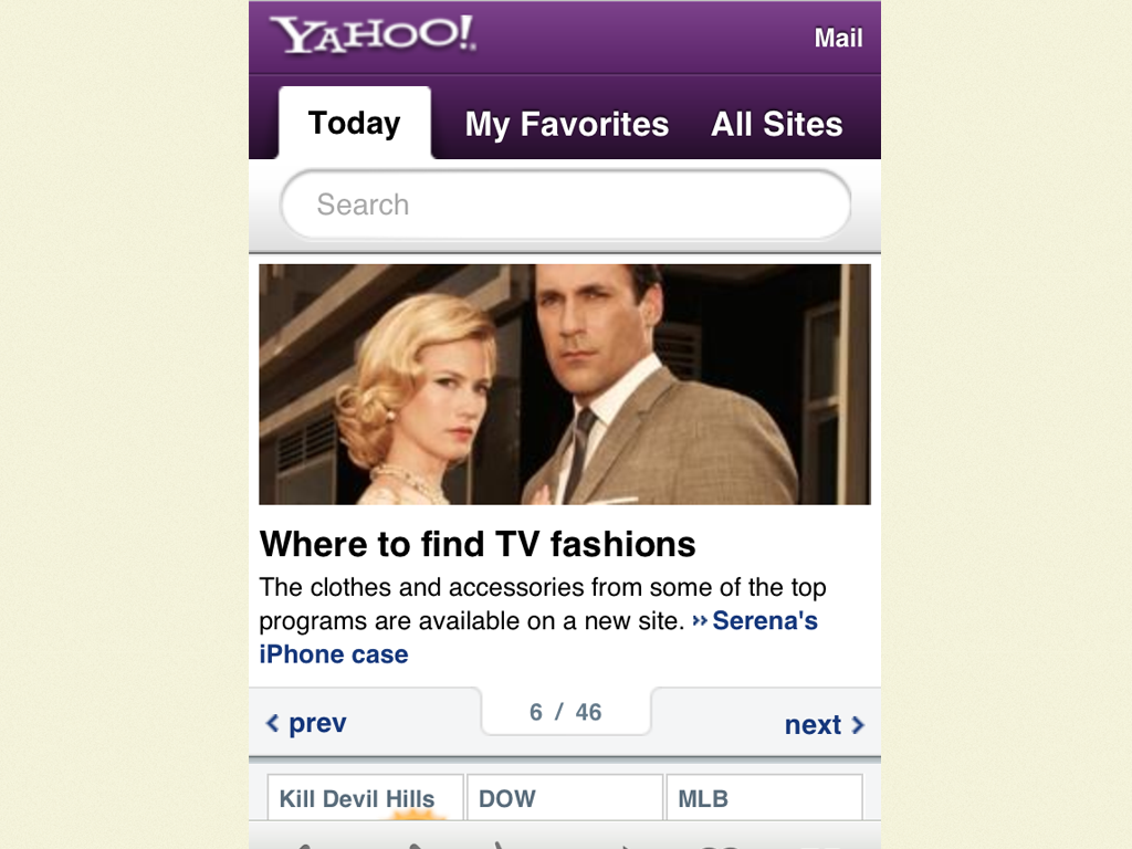
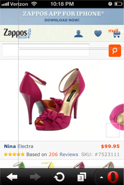
I suspect this is why a good number of carousels exist. From universities to giant retailers, large organizations endure their fair share of politics. And boy does that homepage look like a juicy piece of prime real estate to a roomful of stakeholders. It's hard to navigate these mini turf wars, so tools like carousels are used as appeasers to keep everyone from beating the shit out of each other. It's far harder to have an honest content strategy conversation and determine what truly deserves to be on the homepage. Carousels are complex Carousels introduce a level of complexity to an interface. Instead of simply looking at content on a page, users are burdened with having to identify the carousel and then learning its controls, conventions and behaviors. They also require more scripts and introduce more moving parts, which means more QA and more potential to break. Complexity isn't necessarily bad, and you can certainly justify extra effort for something that will pay off, but... Carousels just aren't that effective Looking at Erik's data, it becomes quite clear that carousels just don't get interacted with all that much. Moreover, Jakob Nielsen posted that these large carousel areas annoy users and also cause them to skip over that featured area. I'm pretty sure that's the exact opposite of the intended effect. Even though carousels aren't that effective, I somehow don't think they're going away any time soon. So if you find yourself having to implement a carousel, here's some things to consider. Cycle through like items You might think this is an obvious point, but many carousels out there contain a venerable grab bag of disparate crap. E-commerce sites are notorious for the amount of miscellany they feature in homepage carousels. "Hot Summer Sale!" screams Panel 1. "Like us on Facebook!" pleads an undeniably desperate Panel 2. "Did you know we carry men's footwear, too?" inquires Panel 3 to no one in particular. Make navigation obvious Tiny little semi-transparent dots all by their lonesome are an ineffective way of communicating a carousel to a user. I've spent quite a bit of time behind a one-way mirror watching user after user gloss over carousel areas because they don't understand the area is interactive. Even iOS (where this design pattern was popularized) users skipped right over and commented on the fact that they had no idea that there was more content available. I often point to Yahoo's iPhone-optimized site as one that does a good job being explicit with their navigation. It provides clear 'Previous' and 'Next' buttons, a good sense of where you're at in the carousel, controls that don't overlay content, and tappable targets. Only load what you need If you have a carousel with 47 items in it, don't load all 47 by default. This again might seem like an obvious point, but it's important to understand that all those extra panels incur serious performance overhead. Considering many (read: most) users won't ever even get to panel #2, make sure you're not burdening your users with extraneous downloads. Suggest more content to users In The Overflow Pattern, I recommend that it should be clear to the user that there's more content to be had. This could be an overhang, set of arrows, scrollbars, gestural hints, auto-rotation, or something else. Whatever it is, it should be immediately obvious to the user that more content exists offscreen. This could make all the difference in the world in deciding the carousel's effectiveness. Treat touch as an enhancement Carousels can be a great opportunity to sexy up an interface with some touch gestures (and there's some good touch-enabledcarousels out there). But just because touch is available doesn't mean you should exclude alternative forms of navigation. Here's Zappos' mobile product image carousel, which features a nice little overhang to let the users there's more content to be had. However, the issue is that the only way to advance to the next image is to swipe. And that requires touch event support, which not all browsers have (like Opera Mini in the photo above). This thankfully isn't difficult to fix (simply include prev/next buttons in addition to touch), but it's yet another example of where assuming too much comes back to bite you. Provide gestural hints Josh Clark beautifully articulates how touch gestures are invisible, but can be subtly revealed to users. Adding touch to a carousel can be a great idea, but letting users know a carousel is touch-capable can be tricky. A subtle initial animation or auto-advancement might help, but could also be annoying. Take the Brad Frost Carousel Challenge Those are my thoughts on carousels. But as I mentioned at the beginning of the post, we unfortunately don't see too much data on the effectiveness of carousels (most of what I find is all hearsay). So here's your chance. Step right up and take the Brad Frost Carousel Challenge! It would be great to see more data published about carousels, and here's what you can do:
Find a carousel on your site (and I know you gots one)
Add tracking (if not already in place)
Collect data (total clicks, panels viewed and whatever other data you can get your hands on)
Publish the data in some way, shape or form
To earn extra bonus points (and possible superpowers), conduct an A/B test where some users get a carousel while others do not. See what performs better and publish the results. Erik accepted the challenge and I granted him his wish of eternal handsomeness. Sign up now and you too can have your dreams come true! Please advance to Panel #2 for contest rules and details. Related read: Internet Users Demand Less Interactivity - "We Just Want To Visit Websites And Look At Them," Users Say
*[DETAILS]: Device, Environment, Time, Activity, Individual, Location, Social

