Complex Navigation Patterns for Responsive Design
Brad Frost Complex Navigation Patterns for Responsive DesignThe most frequently asked question I get since posting my responsive navigation patterns article is: How do I handle complex navigation for responsive designs?" Great question, but before we get down to brass tacks, I urge you: use mobile as an excuse to revisit your navigation. Look at your analytics. What are your experience's key sections? Where are people spending most of their time? Do you really need your privacy policy in your primary navigation? Focus. Use mobile's lack of screen real estate to cut through political bullshit ("But I want to be in the nav too!") and strip away dead weight. Your users will thank you. Another thing: if you have a zillion sections and pages, prioritize search. A search form is an effective way of getting users to where they need to go without having to wade through fifeteen levels of navigation just to get there. OK, now that all that's out of the way, time for some real talk. Sometimes it's not realistic to whittle your thousands of pages of content into three tidy little links that neatly fit on a mobile phone screen. Sometimes you're just a giant retailer. Sometimes you're a university with a ton of audiences and a ton of content. Sometimes the person who runs the cheesy "bulletin board" section of your site will literally eat your face if you were to remove their link from the navigation. Sometimes you just have a complex navigation. What's a girl to do? Here are some emerging patterns for dealing with complex, lengthy and/or multi-level navigations:
- The Multi-Toggle
- The Ol' Right to Left
- The 'Skip the Sub-Nav'
- The Priority+
- Off-Canvas Flyout
- The Carousel+
The Multi-Toggle [caption id="attachment_4362" align="alignnone" width="650" caption="Barack Obama's Multi-Toggle Navigation from his redesigned campaign site"]
- Scannable - users can quickly scan parent categories before making a decision to go to the next level.
- Scalable - Got a menu that's 17 levels deep? This solution can technically handle it with ease (but please don't do that)
Cons
- Not terribly sexy - tapping through a bunch of Russian nesting doll navigation levels isn't the most elegant thing in the world, but then again I suppose you could say that about any multi-level navigation solution.
- Potential JS requirement - I say 'potential' just because most accordion-style interactions I've seen uses JS to make the interaction happen. However, the brilliant Aaron Gustafson demonstrated that you can accomplish this effect using CSS's
:targetpseudo-class. Pretty neat! Also, a JS requirement itself isn't necessarily a con, just make sure the navigation is accessible for users with poor/no JS support.
Resources
- Build a smart mobile navigation without hacks
- Animate using min-height by Lea Verou - This technique is insanely badass. I use it for all my height-animating needs, including accordions.
- jQuery Accordion
In the Wild
- Barack Obama's (redesigned) site in conjunction with the footer anchor pattern.
The Ol' Right-to-Left [caption id="attachment_4365" align="alignnone" width="475" caption="Sony's small screen navigation"]
- Sexy as hell - It's not often you 'ooo' and 'aah' over navigation, but the right-to-left animation is certainly elegant.
- Follows mobile conventions - most major smartphone platforms have some form of right-to-left animation convention for drilling down into an experience.
- Scalable - Good for navigations that have a lot of levels.
Cons
- Complex - Not necessarily a con per se, but this pattern has a lot of (literal) moving parts. Just make sure to keep things accessible, cover your bases and test on as many different devices as possible.
- Animation performance - Animation performance varies greatly across different devices and platforms. Some mobile platforms handle animations just fine, while others are choppy as shit. And keep in mind that some platforms don't support animation at all, so the sudden change in nav state may be jarring to the user.
In the Wild
-
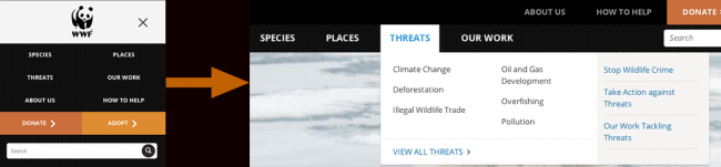
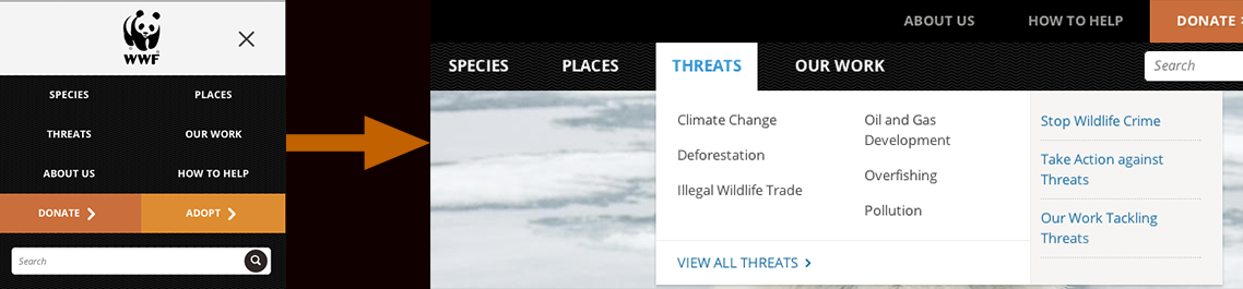
Currys The 'Skip the Sub-Nav' [caption id="attachment_4368" align="alignnone" width="650" caption="World Wildlife Fund's Responsive navigation bypasses the sub-nav for small screens and users are taken straight to the category landing page instead"]
-
Avoids having to deal with sub-navigation altogether - Simply taking the user to a new page removes the headaches that arise from dealing with sub-nav. While it may feel like cheating, remember that tap means intent for devices without hover states. So when a user taps on "clothing" and then gets taken to the clothing landing page, they're getting what they wanted.
-
Simple - Links to other pages. Web design 101.
Cons
- Requires a full page refresh to access sub-navigation items. - This is a pretty big con. Having to go to an entirely separate page isn't terribly efficient for quick navigation.
- Small screen users still download sub-nav content - This can also be a pretty big con. It's a classic case of mobile users downloading elements that they won't ever use. However, it doesn't have to be this way. Sub-navs, especially huge fucking mega menu monstrosities stuffed to the fucking gills with a bunch of shit and images nobody wants anyways......where was I? Ah yes, can (read: should) be conditionally-loaded so that small-screen users don't have to download unused
crapcontent.
Resources
-
An Ajax-Include Pattern for Modular Content In the Wild
-
Boston Globe AJAXifies it's sub-nav like it should be done.
Priority+ [caption id="attachment_4379" align="alignnone" width="650" caption="Priority+ Pattern"]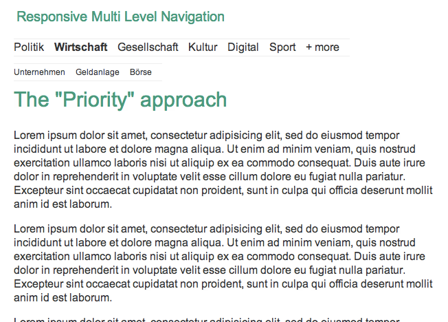
- Relatively simple to implement - The logic required to execute this technique isn't terribly complicated. It's just a basic show/hide toggle to reveal the hidden navigation items.
- (hopefully) exposes the most accessed features - it's hopefully revealing the three or four things the majority of users frequently access anyways.
Cons
- Hides potentially important nav items - what you may deem most important may not be what's important to your users. Burying nav items means having to make some assumptions, and while it hopefully works out for most users, it might also piss some people off.
- Doesn't work well with multi-level navigation - The priority+ pattern seems good for navs that have a lot of items at the same hierarchy level, but unfortunately it doesn't seem to solve the sub-nav dilemma.
Resources
In the Wild
- William and Mary
- USA Today's mobile site section pages don't follow this exactly, but expose the most important categories by default and an arrow or swipe reveals the remaining navigation items. Pretty slick.
Off-Canvas Flyout [caption id="attachment_4399" align="alignnone" width="650" caption="Obama's Left Flyout Nav"]
- Off Canvas Multi-Device Layout
- Off Canvas Multi-Device Layouts
- Off-Canvas demo by Jason Weaver
- Off Canvas Layouts in Zurb Foundation
In the Wild
- Facebook's mobile site
- Previous version of Barack Obama's site
The Carousel+ 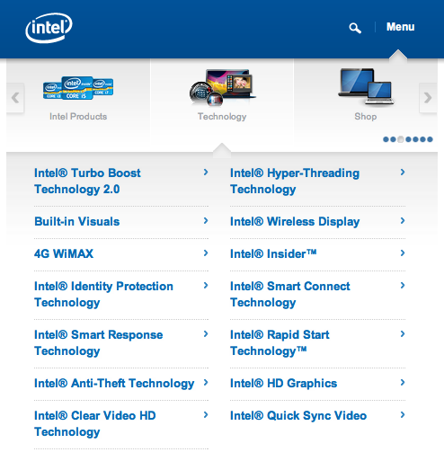
- Relatively sexy - This is certainly a unique and elegant solution for complex navigation.
- Plays well with touch screens - the ability to swipe through a little carousel is a pretty cool interaction and is decently efficient at getting you where you need to go.
Cons
- Doesn't expose all parent categories at once - Like the Priority+ pattern, the Carousel+ pattern requires interaction to occur before the user can understand what options are available to them.
- Cumbersome for non-touch devices - a swipe-enabled carousel is great, but there's still a lot of environments and devices that don't support javascript touch events. For those environments, the user has to resort to arrows that advance one category at a time, which can be quite tedious.
- Not conducive for multi-level navigations - This pattern can work if you have only one level of sub-navigation, but doesn't scale beyond that.
- Weird proximity issues between main navigation and sub-nav - There's a bit of detachment between the first level nav items and sub-nav items that doesn't quite feel right. Maybe it's just me.
In the Wild
- Intel's mobile site - Yes I know it's not responsive, but that doesn't mean this pattern can't be used in a responsive environment.
Onwards! Fitting a complex, multi-level navigation onto small screens is difficult no matter what way you slice it. Remember to use mobile as an excuse to focus, prioritize search, and subtract what you can before embarking on a complex navigation implementation. This collection of navigation patterns is in no way comprehensive, so feel free to point out some other interesting solutions you've seen. *[DETAILS]: Device, Environment, Time, Activity, Individual, Location, Social