Earlier this year I had the tremendous opportunity to create a responsive mobile site for Entertainment Weekly. I was privileged to work with some ridiculously talented people on this project:
Josh Clark was our fearless leader. He assembled the team, guided the design process, managed the client, and provided a positive attitude that made the project a joy for everyone to work on.
Dan Mall and Scott Cook headed up the visual design direction, working with type, color, layout, and providing all sorts of valuable feedback for my work. And yes, they live up to their name.
Jonathan Stark rassled JavaScript. It was great working with such a renowned JS expert as it allowed me to focus on building the interface, while still being able to learn a bunch of good JS practices along the way.
Robert Gorell rolled up his sleeves with content and IA work. It was a blast working with someone with a great sense of organization without getting too verbose on paper.
Kristina Frantz provided much-needed project management, as the entire team was literally all over the map throughout the course of the project.
And as for me, I created the HTML and CSS for the site.
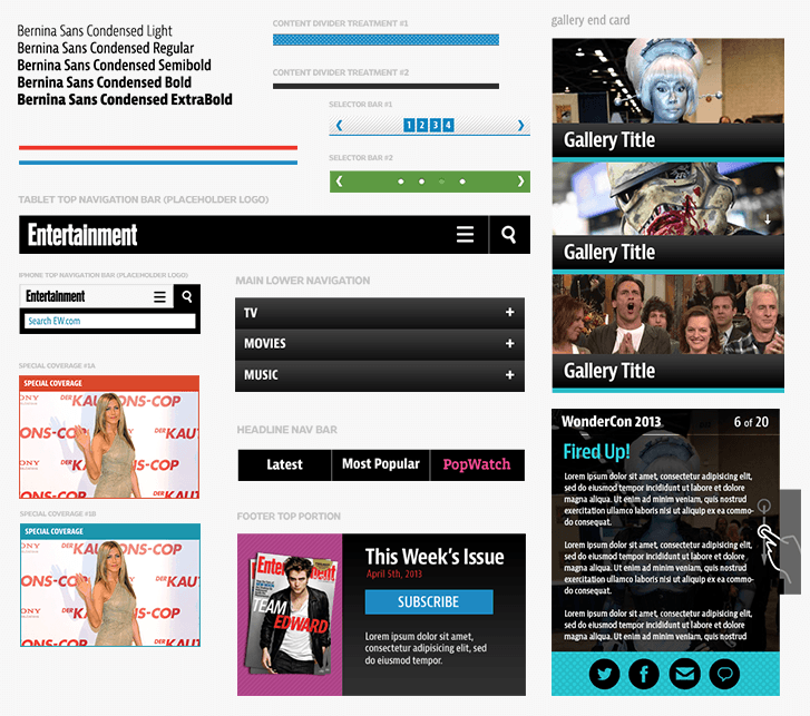
The Process Kicking Off We met at EW's office for a kickoff meeting where we conducted stakeholder interviews and did some design exercises to get everybody aligned. Dan did a great job explaining the exercises, so check out his post. I found those exercises so effective I've been using them since (I explain the exercises in detail for our Pittsburgh Food Bank open redesign project). Development As Design Once the kickoff meeting was complete, I went away and sat on my hands until the designers were finished doing their thing. Just kidding. Thankfully, everyone on the project understood that development is a key part of the design process. From day one, I was able to roll up my sleeves and get right into the browser setting up Pattern Lab. EW was the second project where we utilized Pattern Lab, a tool I made in order to create atomic design systems. Working with Pattern Lab Once Pattern Lab was up and running, I was able to create a whole slew of global atoms, molecules, organisms, and templates. Even without any idea of what the site's content, layout, or visual design would be, I was still able to make a lot of progress in code. A site's going to have a header and footer. Because of the nature of EW's site, I was pretty sure there'd be some articles, so we'd need headings, lists, blockquotes, and the like. The site is ad supported so I set up some FPO ad placeholders. People would want to search so I made a search form. They'd want to comment, so I made a comment form. I was pretty sure there would be a homepage, an article page, some sort of section page. You get the point. Setting up these patterns in HTML in advance allowed us to get the site into its final environment much faster, allowed us to iterate quickly, and gave the other designers a sense of how each component would react across different screen sizes. This also gave us the chance to show the client the site in the browser, which gave them a more realistic idea of how their site would look and function. And it also helped everyone understand the merits of atomic design. HTML Wireframes As Robert sunk his teeth into the content and IA of the site, I worked closely with him to establish the site's patterns and modules. He did a beautiful job blocking out each page's content and their hierarchy in his sketches: I immediately took these sketches, set up new and molecules and organisms for each block/section in Pattern Lab, and hooked everything up in their respective templates. In just a few days I was able to replicate everything in his sketches in the browser, which gave us the opportunity to view the crude designs on real devices, have discussions about hierarchy and potential pain points, and shift things around accordingly. Increasing Fidelity While Robert and I were blocking out bits of content, Dan and Scott were hard at work working out the more visual aspects of the design system: color, typography, texture, look and feel. They used element collages to establish a design direction without having to do full mocks. Once we were all happy with the basic vibe of the visual design, we were able to start rolling in the visual aspects of the design into the prototype. I started by styling the header and footer, then worked my way inwards styling each organism until there were no more gray blocks left. As the project progressed, Dan and I noticed something interesting. A lot of the static visuals they were creating were more guides for my benefit rather than artifacts to show the client. I would work in the browser, and flag certain organisms that required some extra visual guidance. Dan and Scott would cook up some solutions, I'd implement them, and then we'd show the result to the client in the browser. Strange days indeed. "Real" Development My HTML and CSS design began as lo-fi wireframes, but slowly began to increase fidelity to become the production code. As soon as the markup and basic styling for an interactive organism like an image slideshow was set up, Jonathan could wire up the JavaScript. Because everything was modular, it was really easy for us to work together without stepping on each others' toes. As for the backend, we were working with 10up doing the backend integration. We were in constant communication throughout the whole design process, and they were good at letting us know if they needed certain things to be structured a certain way. And when it came time to hand off the design, we weren't just handing them an arbitrary collection of page templates, but rather a robust design system that they could use, reference, and build upon. The Results I'm really happy with the way the project turned out. I had a great time working with some extremely talented people, and I definitely learned some things along the way:
Collaboration and communication trump deliverables. The Web landscape has changed, so our processes and deliverables need to change as well. I often feel that design artifacts are created to avoid having to actually communicate and collaborate with colleagues and clients. By focusing more on true collaboration, we didn't need a 120 page annotated wireframe document. We didn't need 375 comps showing the layout at small, medium, and large layouts. By working together we were able to collectively establish a design direction then iterate upon it.
Atomic Design is a sound methodology. This project helped solidify the notion that breaking interfaces into atoms, molecules, organisms, templates, and pages actually works. Pattern Lab ended up being a hub for the design process, and ultimately I feel that everyone involved in the project benefitted from approaching the design this way.
Getting into the browser quickly allows us to be realistic and honest with the client and our colleagues. We can demonstrate how our designs react across different screen resolutions and react to different environments. We get a better sense of the feel of the design, how ergonomics factor in, how type renders on different devices, and so much more.
Check out http://m.ew.com and give it a spin! Other Reads Everybody else gave their perspective on the redesign, which I highly encourage you to check out: