Design is hard. Aesthetics are subjective, and all the people involved in a design project all have unique perspectives that result in strong opinions about what content and functionality should be prioritized. As part of our open redesign of the Greater Pittsburgh Community Food Bank, we wanted to get everyone on the same page and collectively establish a design direction. In order to do this, we utilized a couple exercises from Good Kickoff Meetings, an amazing website by the brilliant Kevin Hoffman (@kevinmhoffman) to help web people facilitate better meetings. Earlier this year, I got to take part in these exercises with other clients working with Jennifer Brook, Josh Clark, Dan Mall, and Jonathan Stark, and I feel the exercises were really successful. Yesterday, Melissa and I conducted two exercises with the stakeholders of the Pittsburgh Food Bank redesign project. Here's how they went. 20 Second Gut Test Exercise The first exercise we conducted is called the 20 second gut test. Here's how it works:
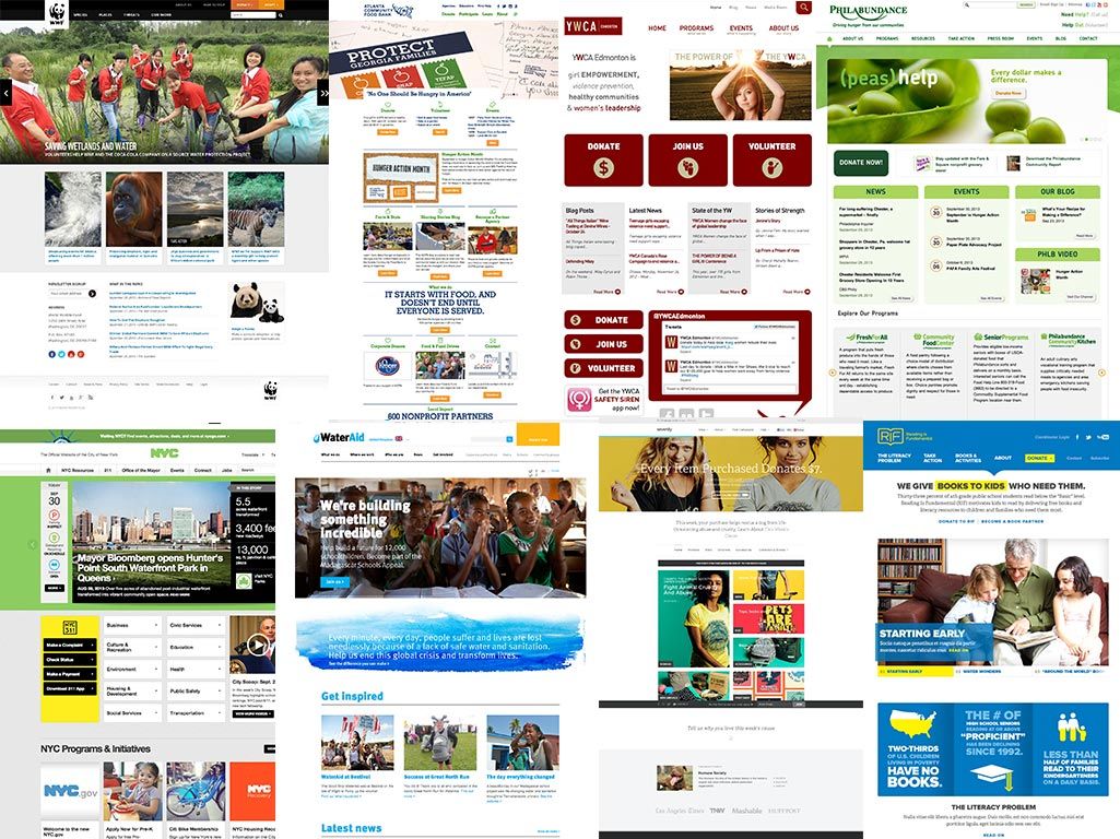
Gather 20 inspiration sites that match up or roughly pertain to your client's site - In our case, Zack and Melissa had collected other food bank, non-profit, charity and government sites. You can view the sites we used here.
Rank each site - We made a Keynote presentation (I made a Keynote template you can download) displaying and scrolling each inspiration site. We asked everyone, "OK, if this was your site (of course swap in your logo, branding, and content), how happy would you be with it?" Everyone had 20 seconds to score each site on a scale from 1 to 5.
Tally the scores - We collect the sheets then dump them into a spreadsheet (I made a template you can download), which tallies up the scores. We then determine the 5 best and worst sites.
Discuss the top and bottom 5 - Now the fun part: discussing what everyone likes and dislikes about each site. Melissa took notes while everyone talked, focusing especially on people's adjectives and language. "It's too busy." "Too bland." "Not enough pictures." "This is really clean." "Really vibrant." "Professional-looking." etc. etc.
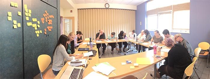
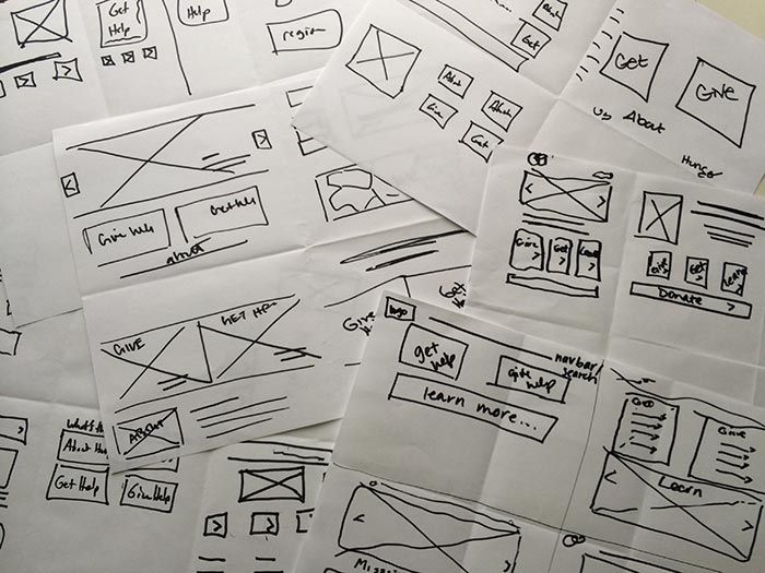
As we went through the exercise, trends began to emerge. By encouraging everyone's input and spending a half-hour together, we discovered what the team valued and what they didn't care for. Because of that, we're able to establish a solid general visual direction without having to do any design work ourselves. Design Studio/Prototyping Exercise We used the momentum from the discussion of the 20 second gut test exercise and jumped right into the Design Studio/Prototyping Exercise. This exercise utilizes what's called The KJ-Technique, which helps a group collectively establish priorities. Here's how we did it. Step 1: Brainstorm Homepage Content We picked a particularly thorny page of the site: the homepage. Homepages are nasty things as they result in turf wars within organizations. That's why we wanted to address it up front. We conducted a timed exercise, where in 5 minutes everyone in the room shouted out all the things that could possibly go on the homepage. Melissa did a great job furiously writing everyone's ideas down on Post-its, which were then stuck to the wall. By the end of the 5 minutes, we had a ton of stickies with things like "donate form", "find help near you", "mission statement", "our services", "contact information", etc. Step 2: Homepage User Feelings We then repeated the 5 minute timed exercise, except this time it wasn't about what content goes on the page, but rather how we want the users to feel when they visited the homepage. The food bank serves a ton of different audiences: people who need help, people looking to donate or volunteer their time, people looking for information, etc. So in 5 minutes everyone generated a lot of adjectives about how they wanted their audiences to feel: "empowered", "not frustrated", "educated", "generous", "part of a community", etc. Step 3: Vote Once we cluttered an entire wall with Post-its, we then handed out 10 stickers to each person. Each person got to give 5 votes to what they felt were the biggest content priorities and most important feelings. Step 4: Discuss We then briefly discussed the pieces of content and emotions that got the most votes. Then we put these insights into action. Step 4: Group Sketching Armed with a better idea of what our content priorities were, we paired people together to do a group sketching exercise. We folded a piece of paper into 6 (2 rows of 3 panels), and conducted a lightning-fast timed exercise. In 3 minutes, generate 6 homepage concepts. Crudely sketch out the page layout. The goal is to generate as many ideas as possible, and not focus on the fidelity of the sketches. That's why the time is so short. Once the 3 minutes were up, we gathered around and each team presented their homepage concepts. Most didn't get 6 done (not many people do), but everyone talked through what they put on the page, in what order, and why they made the decisions they did. Now that everyone heard every group's idea, we began another round. We conducted another 3 minute timed exercise, except this time generating 4 concepts. The group was encouraged to expound upon an existing concept, and/or build upon other teams' concepts. We gathered together again and presented our concepts. The concepts were a little more high fidelity this time around, and everyone used the good ideas generated by the collective group to come up with some more solid ideas. By the end of the exercise, trends began to emerge and we had a strong sense of what content to prioritize based on the collective sketches of the group. Voices Heard These exercises are in no way foolproof, and they're certainly not the only things you can do to establish a collective design direction. But I will say that it's extremely important to get everyone in a room together, talk through opinions, and do things to help everyone think a bit bigger than their own roles and responsibilities. By including everyone in these exercises, people feel like their voices are heard, because they are. Better yet, when Melissa and I roll up our sleeves and start establishing the IA and visual language, the team will have a much better understanding of why we've made particular design decisions. If you're interested in following along with our open redesign, feel free to follow the project timeline.
*[DETAILS]: Device, Environment, Time, Activity, Individual, Location, Social
*[RESS]: Responsive Design with Server-Side Components