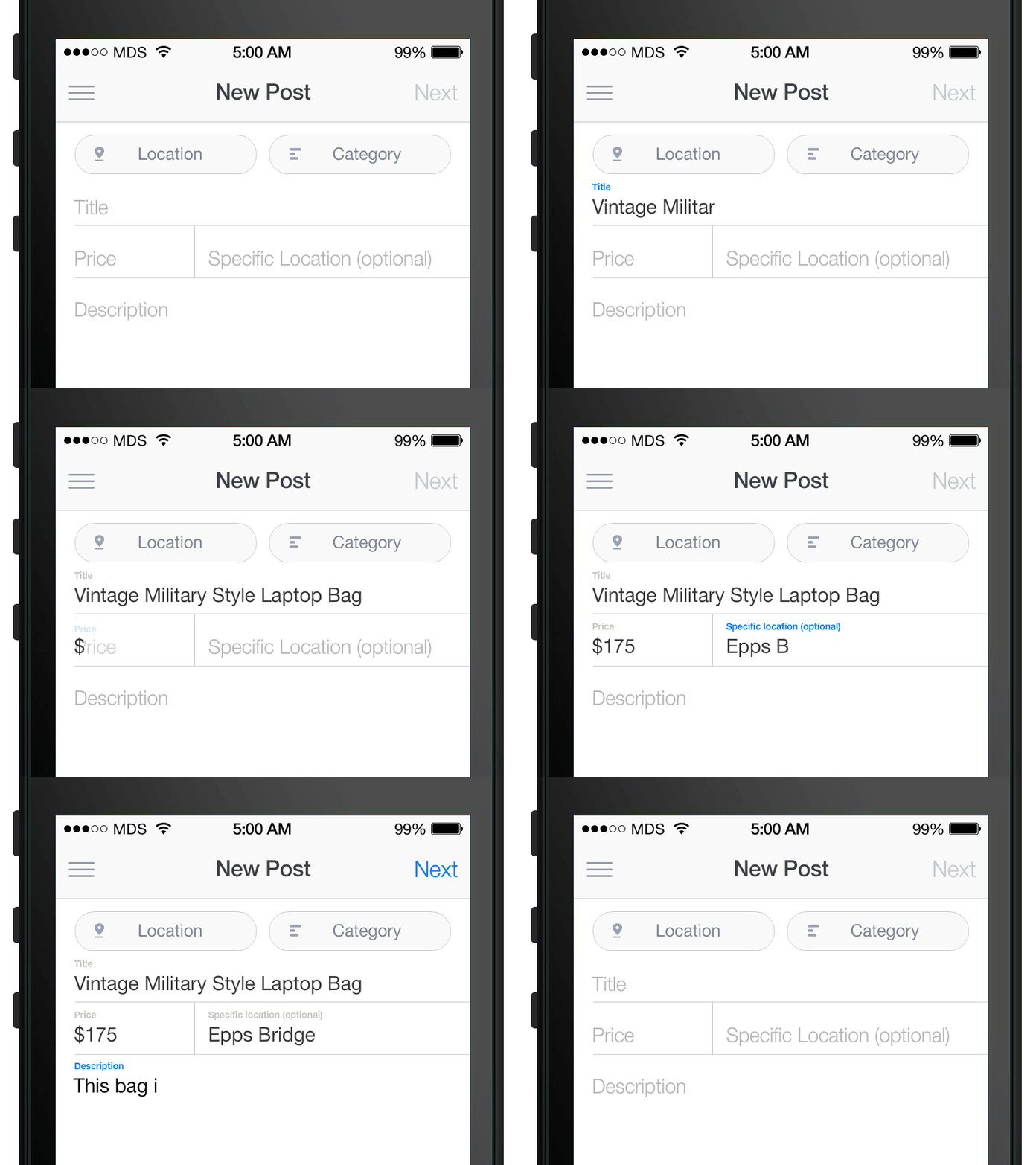
Float Label Pattern
Brad Frost Float Label Pattern[caption id="attachment_6986" align="aligncenter" width="800"]
- Saves space –This is the big advantage of inline labels. With inline labels, designers can fit more of the form in a single screen and reduce the user's need to scroll.
- Act button-y. Inline labels turn form inputs into button-like objects, which is nice considering we're tapping on them with our big fat sausage fingers.
- Cleaner –I argued with many a designer over inline label accessibility over the years, and their main push for inline labels was because it creates a much cleaner experience.
Inline Label Cons
- User loses context –The biggest disadvantage of inline form labels is that the user loses the context of the input once they focus on the field and after they've entered a value.
- Placeholders aren't a replacement for labels –These inline labels sit where the
placeholdertext should go, and some demos remove thelabeltags altogether. That's a massive accessibility concern. - Can't use
labelandplaceholder–Thelabelis occupying the space of theplaceholder, so we can't provide users with extra hinting. This might not be a problem for fields like "First Name" and "Last Name", but can be troublesome when trying to communicate fields that may require certain formats, like dates and phone numbers.
The Float Label Pattern Designer Matt D Smith shared a Dribble shot of a clever new form interaction pattern. The float label pattern floats the inline label up above the input after the user focuses on the form field or enters a value. Float Label Pros
- User keeps context –The main advantage of this pattern is that the user keeps the field's context after they've focused and entered a value. This provides for a more accessible, less frustrating experience.
- Clean and scannable by default –This pattern allows for a clean inline label experience by default, and only becomes a little more cluttered once the user has filled things out.
- Elegent –It needs to be said: this pattern is sexy. You usually can't say that about forms. It looks good and the animations are a nice subtle touch.
Float Label Cons
- Still doesn't provide room for both
labelandplaceholder–Because the label is occupying the same space as the placeholder, there's no room for additional hinting. - Small Label –The label becomes small and possibly hard to read, but at the same time it's not as big a deal. Once the user has interacted with the input, the label becomes a reference rather than an instruction.
- Potential for code abuse –Based on the few demos I've seen, there's the possibility of wrecking accessibility and semantics.
Considerations
- Progressively Enhance –This pattern seems great, but make sure the default experience is an accessible, usable form that includes
labels,forattributes,tabindex, and all those other form best practices. Detect JS, animation, and other support using something like Modernizr and go from there. - Usability trumps cleanliness –The lack of
placeholderwith inline labels can create a more ambiguous experience. Remember, the goal of form design is to get people to fill out the forms as easily as possible. Often times designers sacrifice hinting and instruction for the sake of cleanliness (think of how many times you've entered a password only to find out after the fact that it required 3 numbers, 2 exclamation marks, 12 uppercase latters, and a whammy bar.) A little hint goes a long way. - Be mindful of spacing and size –Some of the demos I've seen implementing this pattern would be frustrating for a mobile user, due to the close proximity of the inputs. Make sure to space things out accordingly to account for fat fingers.
- Legibility –The floated label can be small, but make sure the user can still read the label. Also, provide adequate contrast for the inline labels. Designers love some light-gray-on-white, but that can cause accessibility issues.
Ultimately, I think this pattern is a great way to overcome a lot of the shortcomings of inline labels. I can't wait to see the concept taken further. Resources
- Float Label Form Interaction–Matt D Smith's Dribbble shot
- JVFloat.js–A JS plugin that implements the float label pattern.
- JVFloat.js - the experiment with form Accessbility and UX in HTML5–A blog post about JSFloat and the float label pattern.
- Float Pattern Demo–A nice demo of the float pattern by Aaron Barker
- Mobile Form Usability: Never Use Inline Labels–A really good read explaining the pitfalls of inline labels.
- The HTML5 placeholder attribute is not a substitute for the label element is a good accessibilty reminder from Roger Johansson.
- Making Inline Form Labels Suck Less–A great related concept that throws inline labels out to the left on focus.
- How the Float Label Pattern Started–Matt D Smith wrote up some history and thinking behind the float label pattern.
*[DETAILS]: Device, Environment, Time, Activity, Individual, Location, Social *[RESS]: Responsive Design with Server-Side Components