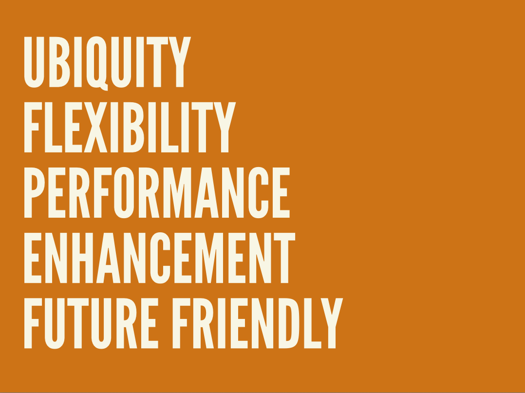
I Have No Idea What The Hell I Am Doing
Brad Frost I Have No Idea What The Hell I Am DoingI recently had the opportunity to be the opening keynote at Generate Conf in New York City. I got a chance to talk about dealing with uncertainty of the future. Here is the video of the talk: And here's the transcript: Thank you. How's it going New York? It's good to be back. Like Oliver said, my name is Brad Frost, and I have absolutely no idea what the hell I am doing. Thank you Dave Rupert for coming up with this beautiful title slide for me inadvertently. I think that we're a lot like this kid. We're just getting blasted in the face with more things than ever before. We have to make things that work on more devices, more device classes, viewports, browsers, environments, user settings. There's more technologies to use, more software, more tools, libraries, frameworks, for us to choose from. And just to keep up to date with everything, we have to follow more blogs, more Medium posts, morePastry Box posts, Net Magazine posts, more tutorials, more podcasts, more conferences, more videos, more newsletters, more tweets, more opinions to pay attention to. The funniest part about this scene is–well the whole thing's funny–is that he's just sitting there taking it. He doesn't have to be, but he's like "Who are you? Why are you doing this to me?" But he has the option, right? And again, we are this kid. We have the option to decide whether or not we want to sit there and get blasted in the face by all of this stuff and continue to be overwhelmed and inundated with technology and decisions. Or we can figure out a way to step away from the hose. Responsive Design So this is our reality now. This is, as web designers, this is what we're struggling with. We have all these different tools, all these different viewport sizes, all these different device classes. And this is the promise of responsive web design. Now all of a sudden we can create these layouts, these squishy websites, that just magically adapt their layout depending on whatever the viewport size is. And that's fantastic, because boy do we have a lot of viewport sizes we have to support now. But for whatever reason even still to this day, five years later–responsive design just turned five years old–I still see a lot of this. Read some tutorial on responsive design and I see values like 320px, which is an iPhone 4 in portrait mode. 480px, iPhone 4 in landscape mode. 768px, an iPad in portrait mode. 1024px an iPad in landscape mode. The fold. Oh god the fold. All the time. All the time with that. But this idea that there are such things anymore is just totally out the window. Samsung shits out a different-sized black rectangle every 30 seconds. And Apple's in the game now too. The iPhone 6 and 6 Plus, I love this GIF: 
Any attempt to draw a line around a particular device class has as much permanence as a literal line in the sand. Jason Grigsby
It's selling the Web short–and what we do short–by trying to put things in buckets and only caring about phones, tablets, and desktop machines. It's our job as responsive web designers to not just cater to the current crop of devices out there, but also recognize that we just don't know. I don't know, the people that write at The Verge don't know what the devices next year are going to be and what their viewport sizes are. So it's up to us to craft layouts that work on any viewport. So I made a little tool called ish. It's called "ish" because when you hit the "small" button it gives you a small-ish viewport, you hit the "medium" button it gives you a medium-ish viewport, and you hit the "large" button and it gives you a large-ish viewport . And you hit it again and it gives you a different value. The idea–this isn't terribly practical from a development or design standpoint–this has everything to do with educating our clients, our stakeholders, our colleagues, that yeah it's on us. We're not just making something that's going to look good on an iPhone; it's our job to make an experience that's meant to be beautiful and functional across any device, any viewport size that happens to access our site. Of course there's the client-favorite Disco Mode–I threw this in here–it just bounces your screen around. And the clients they look at it and they're like "Hahaha look at it go! Look at it go!" And it's great though, because again it's helping them–it's a bit cheeky–but it gets the point across that what we're trying to do is make an experience that's just totally bulletproof, no matter what viewport size happens to come around the corner. We're ready for it. Progressive Enhancement Viewport's one thing, but as we all know, this isn't the Web anymore, even though we still create on these desktop machines. But now we have all these smartphones, dumb phones, e-readers, tablets, netbooks, notebooks, desktops, TVs, game consoles, all these other things that can access the Web. And these things all have varying capabilities. And that's just what we're having to deal with right now: the watches, the smart fridges that you can go buy today if you wanted to. What's more important than these things that exist today are these question marks. Nobody knows–again not those people at The Verge, or Engadget, or whatever–nobody knows where the device and Web landscape is going to be even a year from now. And yes, our browsers are getting more powerful, our browsers are getting more powerful, yes our machines are getting more powerful, Moore's Law is still very much in effect. But at the same time, there's two parts to Moore's Law. There's the technology itself increasing: faster processors, faster chips, all of that good stuff. But there's also this idea of cheap devices. And we're starting to see this flood of cheap, good-enough devices that Scott Jenson calls the Zombie Apocalypse of these low-powered, underpowered, good-enough Web-enabled devices.
The web is not a platform. It’s a continuum. Jeremy Keith
As Jeremy Keith so eloquently stated, the Web whenever we talk about it in terms of a platform, we're putting it on the same level as iOS, or Android, or even something like Flash. This binary you-either-have-it-or-you-don't. But Jeremy says it's so important to understand that the Web is a continuum. That across all of these different Web-enabled devices, across all of these technologies, browsers, user settings, or whatever, there is a spectrum that we need to support. And the Web is actually very well-equipped to deal with that. And this is why progressive enhancement matters so much, in this day in age. So instead of starting with all these assumptions that we've always had: oh of course the user has the latest version of Chrome. Of course they have JavaScript support. Of course they're on a wired connection. Of course we have their full attention. Of course they're on a large screen size. Of course they're on a capable, efficient input method like a mouse and a keyboard. And making all those assumptions and designing and developing around those things, and then figuring out after the fact how to cram all that shit down into a small screen. Instead we need to do what Luke Wroblewski has been talking about for years now. This idea of flipping everything on its head and embracing the fact that the mobile medium provides these constraints that are extremely helpful for us. In that, instead of making all these assumptions, maybe we should start off by saying: yeah of course the user is on a small screen. On a shitty edge network. Of course they're on a really crude D-pad or touchscreen something that's more of a course input type. Of course they're hurried and distracted. And we solve all our business goals, we solve our user goals, we solve our content goals at that most constrained environment, and then as screen space becomes available, as browser support more available, as features become available, we're able to take advantage of those and layer on enhancement. That is why progressive enhancement matters so much. And there's been this big flood of MVC, really heavy-handed JavaScript libraries. And the thing is always "Oh well nobody switches off JavaScript anymore" and that's true not many people are doing that. But at the same time that doesn't give us a free pass to just all of a sudden skip to the most fragile layer of the stack.
Progressive enhancement is more about dealing with technology failing than technology not being supported. Andy Hume
Because you have to answer the question: what happens when things go wrong? And they will go wrong. And you have to answer those questions. Do you give your users a middle finger in the form of a spinner? (That would actually be a pretty cool spinner). Or do we provide them content and functionality to the best of our ability. Start at that base HTML level, layer on CSS enhancements, and layer on JavaScript functionality. [Note: the video cut out a video of me navigating my insurance company's sluggish, spinner-heavy Web experience. It's a shame because I thought it was pretty funny.] At the end of the day this idea of progressive enhancement, this idea of Web standards, of starting with HTML and layering on CSS and layering on behavior on top of that is foundational work. HTML is ugly. I get it. It's Craigslist. But it's like concrete. Concrete is pretty ugly. It's drab. It's gray. But at the same time its what allows us to build all sorts of great stuff on top of it. Future Friendly There's no such thing as designing a future-proof experience. But that doesn't mean that there aren't things that we can do to better prepare us for whatever's going to happen down the road. And if you think about it–and this is a weird concept–the projects you are working on today are going to be interacted with on devices that didn't exist at the time you made them. And this is something that's happening increasingly–again every day–look at the new watches. This is really cool: This guy's demonstrating checking his Twitter feed on his watch, and happens to go to a website I made a couple years ago. That's pretty cool, right? So this dude can access we made a while ago, before these watches were ever a thing. I wasn't coding up the website going "Oh I bet these watches are going to be browsing this one day." But this is what we're talking about: being future friendly means embracing theunpredictability of the future. Atomic Design
We’re not designing pages, we’re designing systems of components.Stephen Hay
Whenever we're designing for an unknown future, we need to take better stock of what it is that we're actually producing. Thinking about things in terms of screens or pages anymore just really doesn't cut it. We have to break things down to their component pieces. Anybody using Bootstrap or Foundation by Zurb? These things are great. Responsive design is hard. Multi-device Web design is hard. And here are these solutions, these UI toolkits, that we're able to stitch together in any way we want. And it's fantastic, and from a conceptual level I'm totally on board with it. Yeah, let's make this system of components, as Stephen Hay said. But this is my problem with these things. These things are tools. Singular. Bootstrap is a tool. Whenever I watch sci-fi movies as a kid, I could never shake the thought out of my head. Huh, I guess if given enough time, we just solve fashion. Some guy's like "hey I think we should just wear jumpsuits from now on" and everybody's like "Sure. Sold" And look at these happy people, they love it. Obviously humans are a diverse bunch. We have different needs, we have different wants, we have different goals, and desires and all that. So whenever we think about these tools that give us the answers: here's what your dropdowns look like, here's what your buttons look like, and we implement those, you're going to look substantially similar to the other sites that are happen to be utilizing the same tool.
Tiny Bootstraps, for every clientDave Rupert
So Dave Rupert wonderfully summed up what we need to be doing, and that's creating tiny Bootstraps for every client. He goes on to explain further that these responsive deliverables–what we're delivering to our organizations, to our clients, to everybody–should look a lot like fully-functioning Twitter Bootstrap-style systems that are custom tailed for your clients' needs.That custom-tailored bit is the operative part of that sentence. It's up to us to craft our own design systems. Adn that's what's given rise to a lot of these front-end style guides and pattern libraries that have been released. Code for America's is amazing. Salesforce. Mailchimp. Yelp. Starbucks. And whenever you crack these things open, there's patterns like "blocks 3-up". So here's a basic pattern they're using throughout their interface, and you can resize the window to see how it works in a responsive environment. At the same time they're establishing this shared vocabulary they can use for all future things. Here's a featured list with a thumbnail and a headline and an excerpt. Here's your data tables: a little simple one with 3 columns that'll squish quite nicely onto small screens, and then here's one that's more complex and how does that work on small screens? So I've been spending a lot of time thinking about these interface design systems, and how important it is to deliberately build up an interface design system. I'm calling it atomic design, and it's meant to be a very deliberately way to craft your own design system. [caption id="attachment_5984" align="alignnone" width="1024"]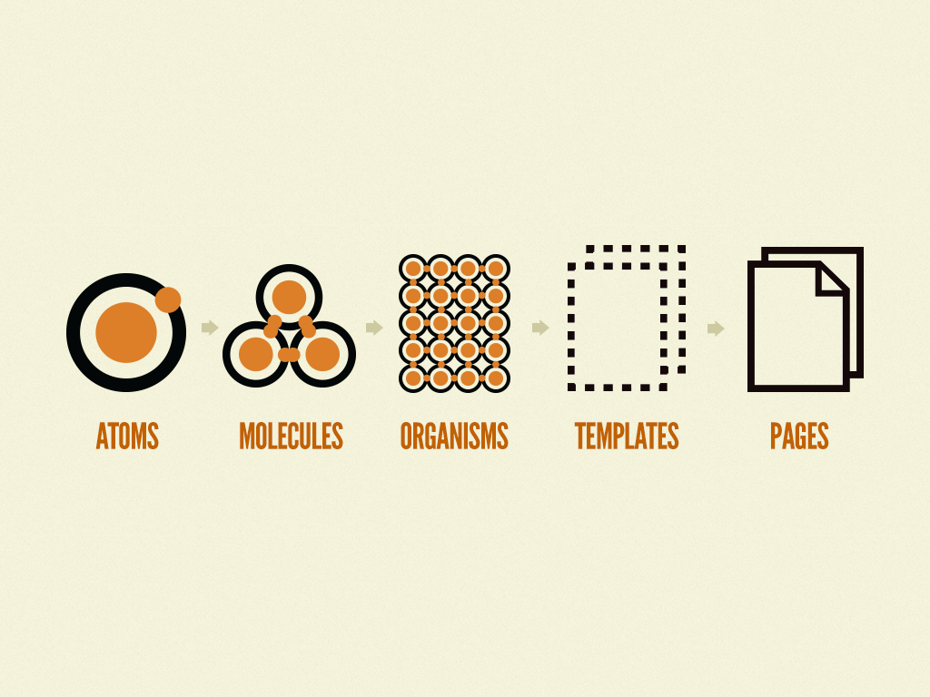
Great minds discuss ideas. Average minds discuss events. Small minds discuss people. Henry Thomas Buckle
I love this quote. So I will take this quote and commandeer it. [caption id="attachment_9280" align="alignnone" width="1646"]
When I am trying to learn a new technology, it's easy to Google and look at a tutorial and read some code. What's hard is to really wrap my head around why I want to use which thing. That's frequently the thing that's not well-explained or well-documented. Jen Simmons
Understanding the underpinning reasons why certain technologies are helpful and useful is so insanely important, but that's not what we focus on. Instead we focus on this torrent of frameworks and Github repos that multiple like horny rabbits. So it's about principles.