ish. 2.0
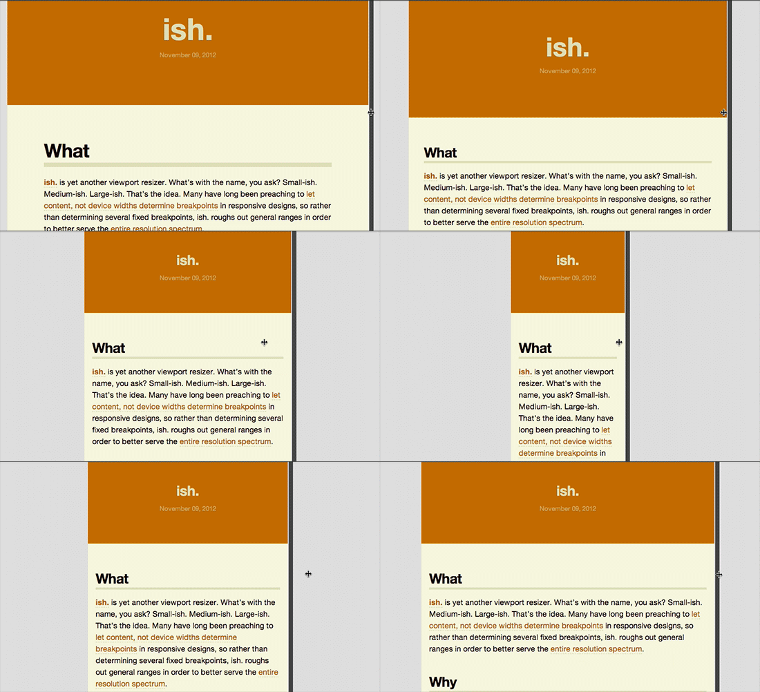
Brad Frost ish. 2.0I'm happy to introduce ish. 2.0. For the uninitiated, ish. is yet another viewport resizing tool. It's called "ish." because it focuses on general ranges (small-ish. medium-ish. large-ish.), rather than popular device widths. It's our jobs as web designers to make sure our interfaces look and function across all screen sizes, and ish. is here to help. Here's what ish. includes: Disco Mode 'Disco Mode' is a fan (and client!) favorite because it's the ultimate stress test for your designs. Disco Mode randomly contorts the viewport to all sorts of random values, which is important to test the resiliency of your designs. Hay! Mode
Start with the small screen first, then expand until it looks like shit. Time for a breakpoint! -Stephen Hay
Stephen's advice to let content, not device breakpoints determine breakpoints is sound. So to honor him I created Hay! Mode, which starts at the minimum viewport size and slowly but surely expands until it's time to stop. Simply hit the Hay button again (while audibly shouting "Hay!") to stop it. Take note of the viewport dimensions and dive back into your CSS. And speaking of getting the viewport dimensions... Pixel-to-Em Converter Translating px units to ems and vice-versa can be a pain in the ass. There are lots of great calculators out there, but this thing is built right into the tool. What I'm most excited about is that you can easily change the value of the viewport to any screen size, and use your up and down arrows to fine-tune the value. Step up and down while focused in the em field to change the viewport 16px at a time, or step up and down through the pixel field for ultra-fine control. That way you can easily hunt down those pesky 1px instances where your design breaks. 

- It gets people to speak the right language –There's nothing more satisfying than hearing a client say "on small screens..." Small screens. Not "iPhone view." Not "mobile view", "iPad view", and "'web' view". By abstracting viewport sizes to "Small, Medium, and Large", clients and colleagues become more considerate of the myriad viewports we're designing for, rather than just the gadgets they have in their pockets.
- Resolution testing is baked into the process –A lot of responsive projects I've seen put off testing smaller screen sizes until the last minute. With ish. built into Pattern Lab, it's easy to consider the entire resolution spectrum the whole way through the process.
- Ensuremolecules and organisms work across the board–It's important for our components, not just pages, to be flexible across the board. Baking a viewport resizing tool like ish. into a pattern library ensures each element is flexible. This will become especially important in the future when element queries and web components are things.
- Designers and clients can give better feedback –Instead of vague feedback, designers and clients can now get really specific ("At 604px the navigation drops beneath the logo" etc). This makes communication between disciplines so much better.
- Development tool –and oh yeah, ish. is a pretty great developer tool. Real-time px-to-em conversion, resizing, Disco Mode, and the rest of it helps me be a better web developer.
Now's the time where I remind you that viewport testing is no substitute for device testing, and that there's a whole bunch of things that you can only learn by testing on real devices. That's entirely true. But with that being said, viewport testing is extremely helpful while you're doing your initial design and development to make sure things aren't totally out of sorts. You can get ish on Github, or just use the demo. *[DETAILS]: Device, Environment, Time, Activity, Individual, Location, Social *[RESS]: Responsive Design with Server-Side Components