Launching a Campaign Website...Quickly
Brad Frost Launching a Campaign Website...QuicklyI had the opportunity to make a website for Brian Forde, who is running for Congress in Orange County, California. Brian got in touch after reading my Designing an Effective Donation Form blog post, and wanted to bring that thinking to his campaign website. So on July 7th we hopped on a call, where I learned that Brian worked as a Senior Tech Advisor in the Obama White House and is running for office so he can improve peoples’ lives, use technology to make government more capable & efficient, and combat the toxic, xenophobic views & policies coming from the other side. All this very much aligned with my own values, so while I typically shy away from political stuff, I decided to take on the project. Then came the big question: when does the site need to be live? “July 17th,” he said. Of course, that meant the site would need done in a little more than a week.
I signed on to build a website in a week the way that some people drunk-buy stuff off of QVC. — Brad Frost ? (@brad_frost) July 7, 2017
Normally building a site in such a short window of time isn’t a great idea, but I took it on for a few reasons:
- I (bizarrely) had availability during that window.
- I wanted to see if I still had it in me to launch a site in such short order.
- But I also wanted to see if I could execute a good design process even with an abbreviated timeline.
- Ian hasn’t experienced the rush of tight-turnaround projects. Most of our work has (thankfully) involved slower, deliberate burns, so I felt the project would give him a good taste of how a lot of people work. Plus, it builds character.
- Like most people depressed with the state of the country, I’ve been asking myself “what can I do to help?” Designing and building websites is what I do, so designing and building a website for a progressive Congressional candidate seemed like a very tangible way to put my skills to use to advance the values I feel are best for the country.
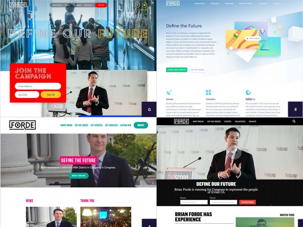
So challenge accepted. This post will talk about how we built Brian’s campaign website in a little over a week. The Process Step 1: Gathering and Setting Up Once the contract was signed on July 8th, we dove right in. Unlike an established brand or company, the campaign was in the early stages of putting their identity and operation together. I asked them to pass along any materials they had, and they sent through a work-in-progress logo, a link to a logo design they ended up not using, some copy for campaign principles, some inspiration sites, and some wireframes and a comp a friend had done: 
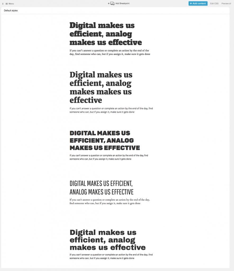
With a few simple spreadsheet columns, we can articulate which display patterns should be included in a given template, and what content patterns they’ll contain. More importantly, we’re able to articulate each pattern’s relative hierarchy and the role it plays on the screen. If you read the leftmost column vertically, you’re effectively looking at the mobile-first view of what the UI could be.
So we created a spreadsheet that stubbed out the IA for each page, defining components, the jobs they need to do, and their order on the page. This allowed the campaign to work through what they wanted the site to accomplish without worrying about layout, color, functionality, etc. Parallel to this process, Ian was working in Pattern Lab to stub out all the pages and linking them together. And just like that, in a few minutes we had a basic bones of a website that would evolve into the final product. Quick & dirty visual direction For visual design direction, I was initially toying with the idea of putting together some style tiles (or rather, their in-browser style prototypes) to talk about color, typography, and texture. But even that felt wasteful. So instead I opted to conduct a 20-second gut test exercise. I rounded up a handful of inspiration sites (including the ones provided by Brian) and used the web inspector to swap in the campaign’s work-in-progress logo, some images I found of Brian from a Google image search, some nav, and hypothetical headlines. I then presented each site to the campaign for 20 seconds, and had everyone vote on how happy they’d be if this was the site that we ended up with. [