Mobile Web Problems and How to Avoid Them
Brad Frost Mobile Web Problems and How to Avoid ThemTwo years ago Jen Simmons (@jensimmons) and I made a site called WTF Mobile Web, a Tumblr which highlights the frustrations mobile web users regularly experience. While the site is a bit cheeky, the goal isn't to cut anybody down, but rather demonstrate the challenges web creators are faced with when delivering their experiences to the plethora of desknots now accessing the Web. So without further ado, here's two years of the most common mobile web problems and what you can do about them.
- Denying Access
- Coming soon!
- Screen size
- Browser support
- Flash
- DRM
- And more!
- URL Redirects
- m. Links on Desktop
- Redirect to Homepage
- Performance
- Making contextual assumptions
- App Doorslams
- Confusing Sites and Apps
- Design
- Fixed Positioning
- Overlays
- And More
Denying Access 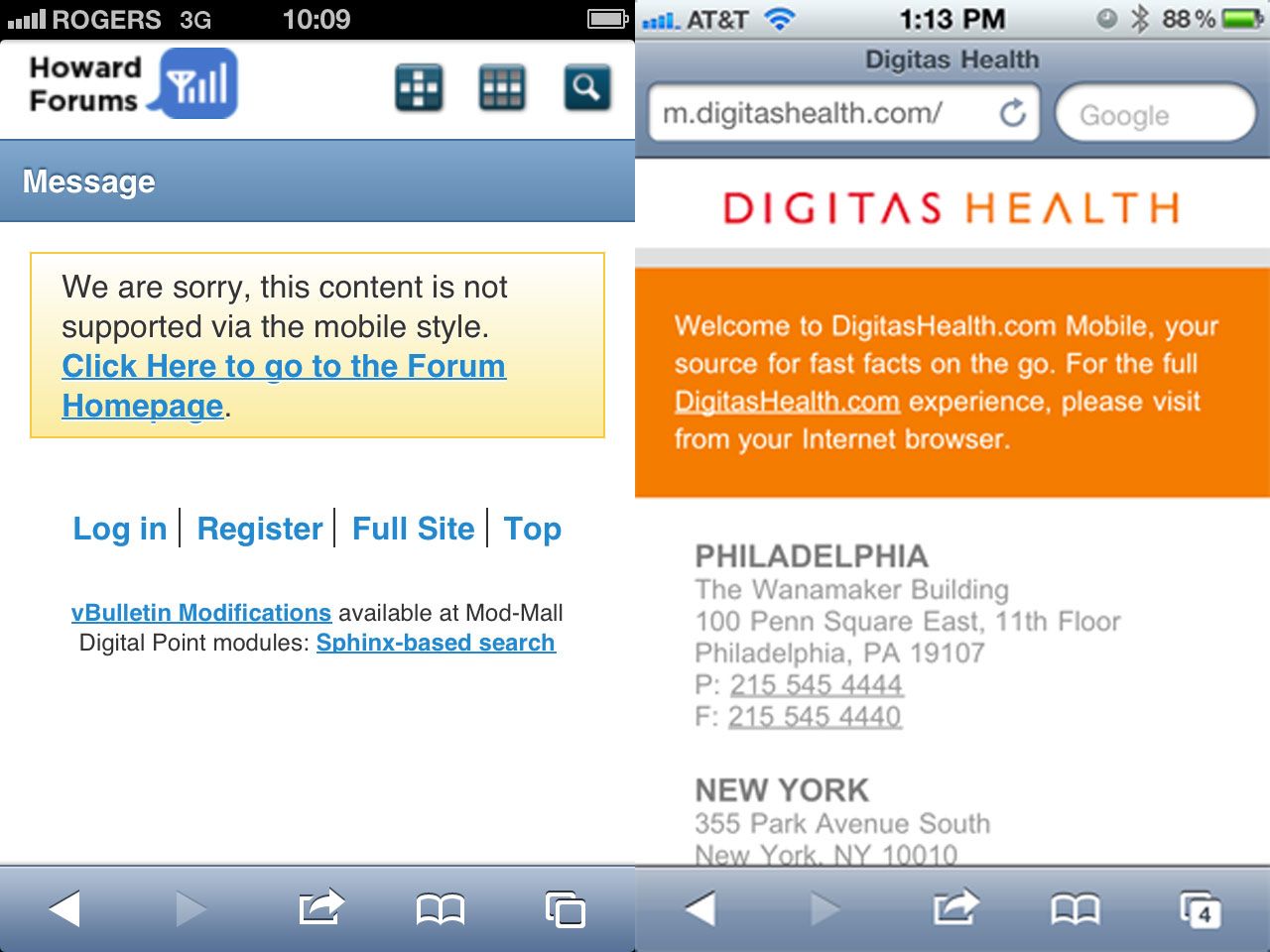
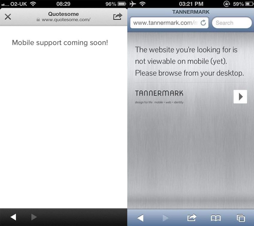
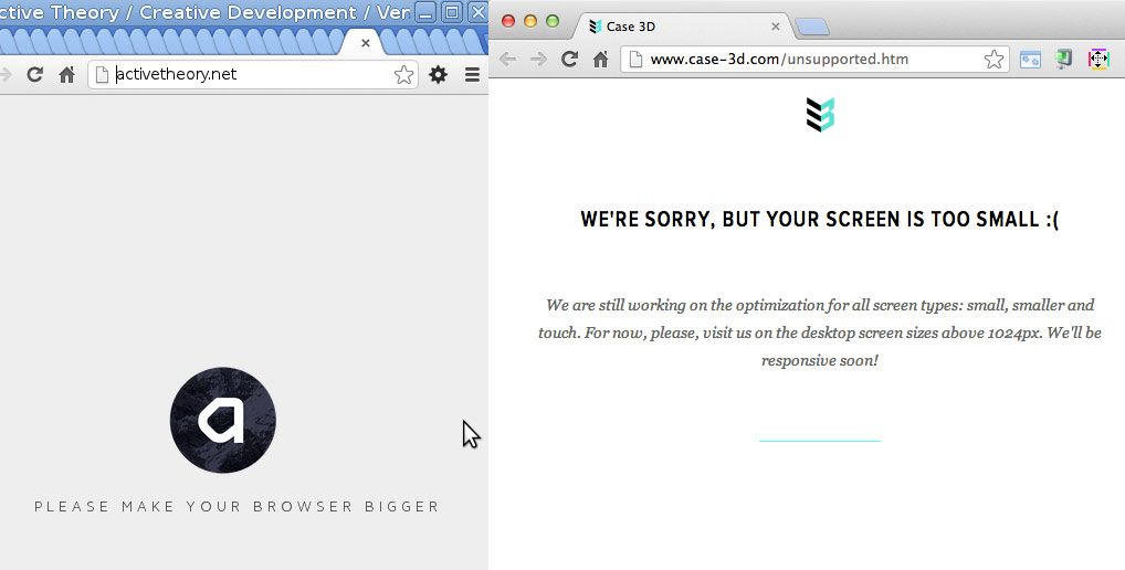
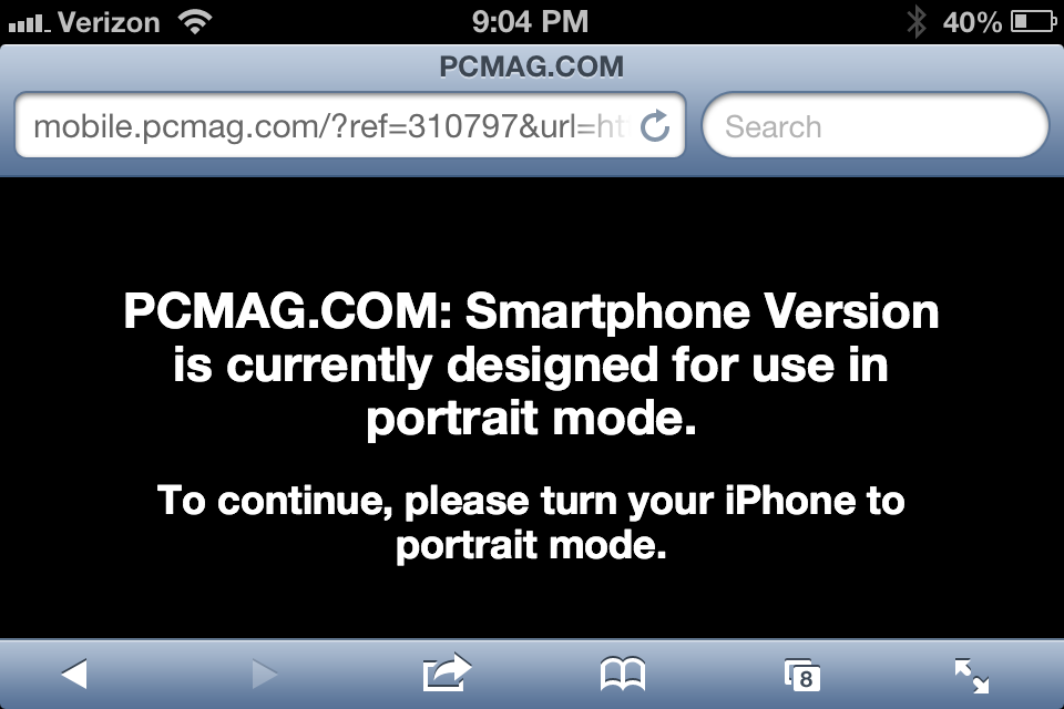


Just make quality, relevant content with appropriate tasks, and offer all of these to all users, [...] then make it easy for the user to decide what it is they want to do.
- Don't make content assumptions based on device or context. Don't assume that mobile users only want "on the go" content. Mobile users will do anything and everything a desktop user will do, provided it's presented in a usable way.
- Desktop-only content is better than no content at all --Don't have all your content optimized for mobile? That's OK. No need to apologize for it, and certainly no need to deprive users your content to tell them that the content isn't mobile-optimized. Users can pinch-and-zoom or awkwardly scroll back and forth, and while that's not as good as having an optimized experience, you'll end up with less complaints so long as users can get what they came to the site to do.
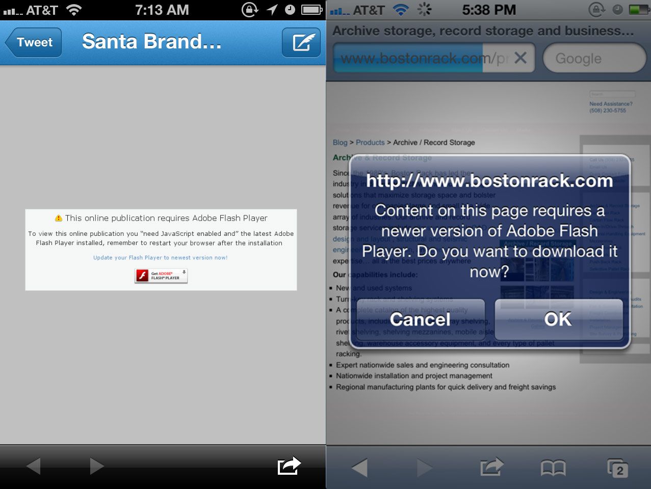
- Ditch Flash --This shouldn't be too shocking, but you should probably be weening yourself off of Flash.
- Don't penalize users for screen size, device capabilities, settings, resolution, etc --Use sound progressive enhancement techniques to support as many environments as possible while still optimizing for the most capable.
- Plant a flag in the sand. It's understandable to not have all of your content mobile optimized right this second. Things take time. But it's important to have a long-term strategy for making all of your content accessible on the whole slew of present and future web-enabled gizmos.
Further Reading
- Content Parity
- Great Works of Fiction Presents: The Mobile Context
- Mobile > Local
- Content Strategy for Mobile
URL Redirect Fails 
- Maintain a single codebase. One of the more invisible advantages of responsive design is that you don't have to jump through all these URL-redirect nightmare hoops.
- Canonical URLs. Sites like Buzzfeed serve a separate mobile template, but the URL stays consistent (so no m. preceding the URL). This ensures that all that link juice stays under the same roof.
- Initiate a future-friendly device strategy. Yes, it's currently possible to keep up with the flood of web-enabled gizmos in a device database. But these solutions are quickly becoming untenable. Start to plan for a more maintainable web strategy that doesn't involve updating a database every time Samsung craps out a new device (which happens about every 30 seconds).
Further Reading
- Common Mistakes in Smartphone Sites (Faulty Redirects)
- W3C Mobile Web Best Practices: Thematic Consistency of Resource Identified by a URI
- URL Design
Performance 
- Performance As Design
- Prioritizing Performance in Responsive Design
- Performance is money, part 1: the end-user's wallet
- Improving UX Through Front-End Performance
- Setting a Performance Budget
- What are Responsive Websites made of?
Making contextual assumptions 
- Select link
- View content
Whereas going the app route goes something like this:
- Select link
- Select interstitial to download app
- Open app store app
- Select 'Install app'
- Enter password
- Wait for app to install
- Open app
- Learn new interface, look for search bar
- Search for the original content from link
- Select link from search results
- View content
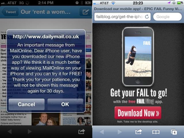
I've begun this process before only to eventually forget what I was trying to check out in the first place. The Solution Don't do this. Google will punish you. Instead, think of more subtle ways to promote your app. Less intrusive banners across the top or bottom don't hit users over the head with marketing and can be easily skimmed over. For iOS, consider looking into Smart Banners, which provide a more native way of handling app promotion. Further Reading
- I Don't Want Your Fucking App
- Lots of appblock examples on WTF Mobile Web
- The User's Choice?
- Linking Mobile Web & Native App Experiences
- Common mistakes in smartphone sites (App download interstitials)
Confusing Sites and Apps 

Design 

- Avoid fixed positioning for a cleaner, more stable experience.
- Avoid popups and overlays. Your users will thank you for it. Not only are they bullshit, but they also introduce potential usability issues where users are unable to close the overlays.
- Simple is usable. Think twice before adding bells and whistles to your Web experiences. I'm not saying there isn't room to make things beautiful, rich and complex. But all of these examples demonstrate that the effectiveness of a mobile Web experience has so much to do with basic accessibility and usability than it does about bells, whistles and purely aesthetic decisions.
Further Reading
Less WTF, More FTW This post has been a long time coming. I started it in spring of 2012. It took Google publishing their thoughts to kick me into high gear and finish it. The good news is that we're seeing progress. Of course there are still problems and there always will be, but combing through 2 years of posts, we're seeing less hideous mainstream mobile web experiences. Again, I want to stress again that the point of WTF Mobile Web isn't to be a jerk and make fun of mobile websites, but rather to highlight the problems we're all facing as creators for this new medium. We need to know what problems we're facing in order to get better. It's been great watching mobile web design transform from a complete afterthought to the center of everyone's Web strategy. That's nothing but a good thing. Here's to progress! *[DETAILS]: Device, Environment, Time, Activity, Individual, Location, Social *[RESS]: Responsive Design with Server-Side Components