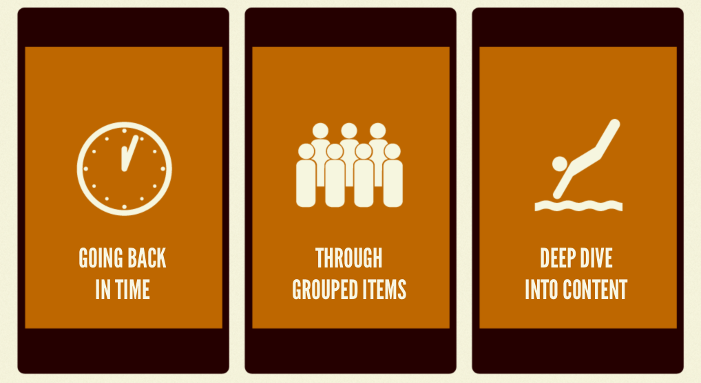
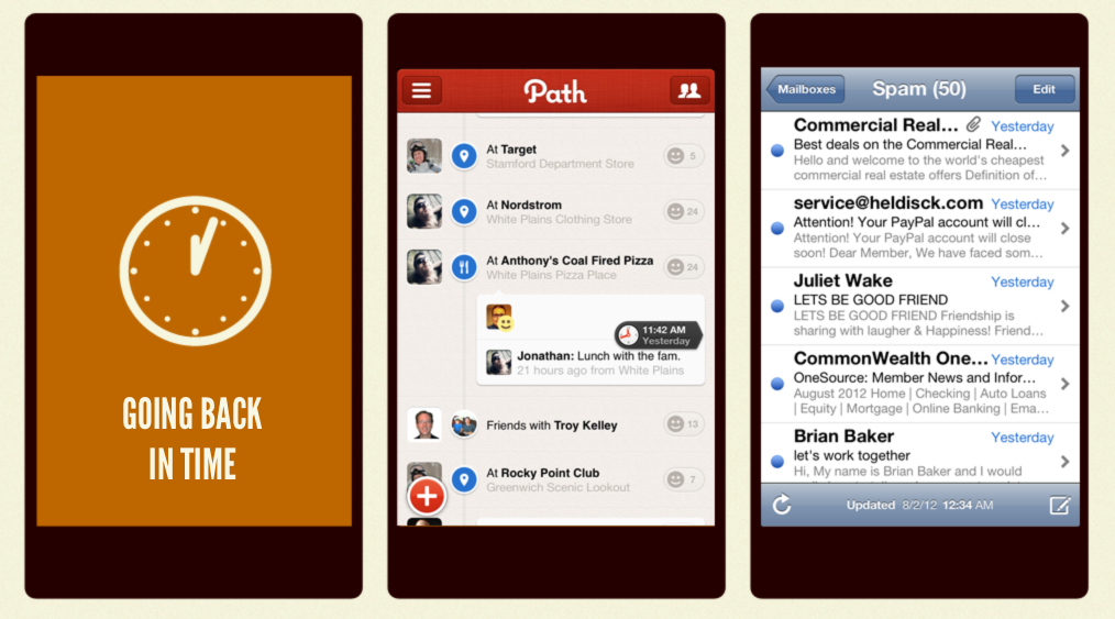
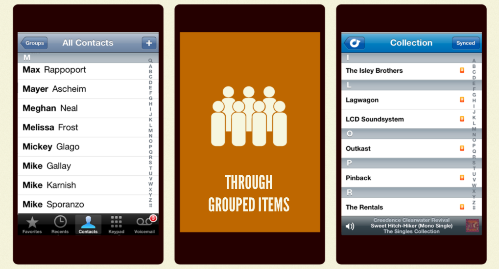
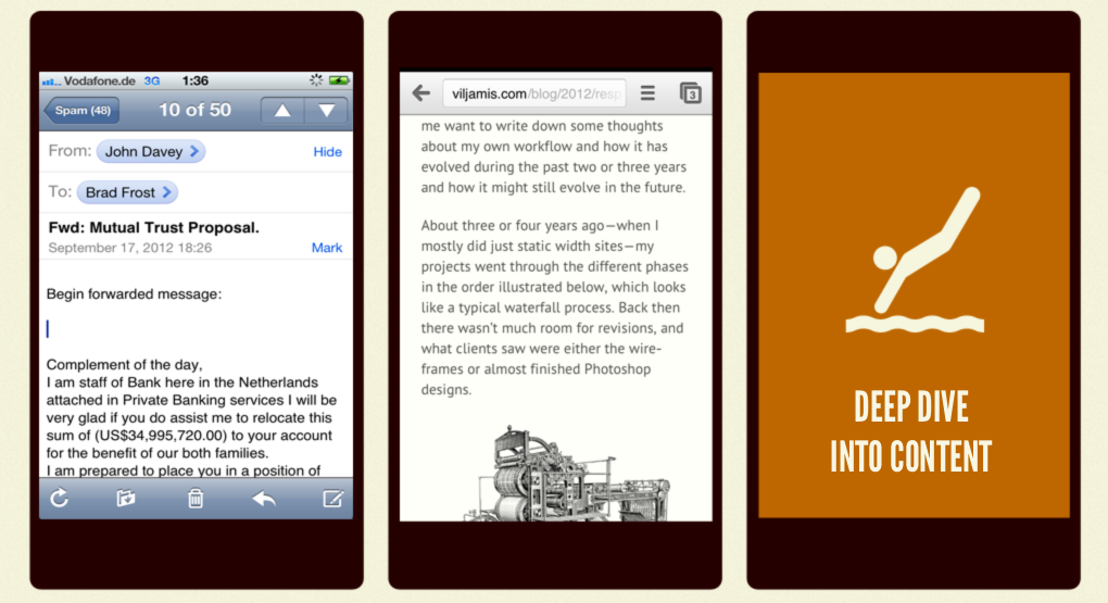
Think about the times you scroll on your mobile phone. Not necessarily on on the Web, but in general. Here are some common scrolling scenarios: Going Back in Time Going back in time is one of the most common mobile scrolling use cases. You scroll back in time when you sift through a endless list of e-mails, scroll through a Twitter feed or Facebook wall, peruse an Instagram feed, or wade through unread RSS items. As you scroll down, the content gets older and older. This reverse chronological order is one of the most common scrolling patterns. Scrolling Through Grouped Items Another common mobile scrolling use case is exploring a group of like items, such as searching for an artist in a music app, searching through your contacts, or searching for a product grid. Typically, items are grouped alphabetically, but they could be arranged by any number of filters: star ratings, popularity, most expensive, least expensive, etc, etc. Deep Dive Into Content Of course one of the most common scrolling use cases is when you simply dive in deep to a piece of content, such as reading an email or an article. Singular Content Type A trend begins to emerge as we look at these mobile scrolling scenarios: we're almost almost always scrolling through a singular content type. And by "singular content type" I mean either a singular piece of content (like an article or email), or a group of like elements (such as posts, e-mails, or photos). Now there are a few trends in web design that fly in the face of these scrolling scenarios. The first is the rise of one-page websites, which include a potpourri of information on a single page. While these one page websites can work when there's enough screen real estate to easily scan the page, they can provide a cumbersome user experience on small screens where users don't have the luxury of screen space. The second trend involves responsive layouts. Many of the popular responsive layout patterns involve stacking sidebars underneath main content for smaller screens. While this certainly does the trick from a technical standpoint, it can lead to confusing user experiences. I discussed long-scrolling pages in my Presidential Smackdown Edition article on Smashing Magazine. I take a look at Romney and Obama's initial homepage designs and compare their page length: As you can clearly see, Obama's site is extremely long and full of all sorts of content types, whereas Romney's site is relatively compact. These mile-long pages can be frustrating and sometimes a bit absurd (as Ben Brown points out). A long scrolling page of disparate information is not a good mobile user experience. The lack of content continuity forces users to go on scavenger hunts to find the content they're looking for, and has other negative performance effects. Considerations As we create responsive experiences, we need to be mindful about content types, content hierarchy, and general flow. Our aim is to create cohesive experiences that prioritize core tasks of a page, while still providing access to secondary information in a way that makes sense. Here are some things to consider: Conditional Loading Conditional loading just might be one of the best tools we have in our responsive toolbox. Conditional loading involves chunking out secondary content into their own HTML fragments, then loading them in only when the user requests them or the conditions are right. Conditional loading creates more performant, scannable experiences while still providing access to the full content or functionality. For more information about conditional loading, check out these resources. Utilize Progressive Disclosure Progressive disclosure is a handy technique to create scannable experiences while still providing access to full content. Wikipedia's mobile site does a great job of utilizing progressive disclosure for article sub-headings: The user can quickly scan the sub-headings, select the section they're interested, then dive into that section's content. Progressive disclosure goes hand in hand with conditional loading, and there are a few patterns that keep scannability in mind while still providing access to full content. Sketch Mobile-first In my experience with responsive projects, I've found that sketching for narrow viewports first is an effective way of establishing content hierarchy and good flow. When we have the luxury of space we tend to add multiple columns, which throws a wrench into establishing a sound content hierarchy. Nailing down an experience's flow on small screens first forces us to get content hierarchy right out of the gate. Be Mindful of Page Height and Scrolling The fold doesn't exist on the Web, but we should be mindful of page length and scrolling when creating responsive experiences.
*[DETAILS]: Device, Environment, Time, Activity, Individual, Location, Social
*[RESS]: Responsive Design with Server-Side Components