Responsive Navigation Patterns
Brad Frost Responsive Navigation PatternsUpdate: I've also written about complex navigation patterns for responsive design. Top and left navigations are typical on large screens, but lack of screen real estate on small screens makes for an interesting challenge. As responsive design becomes more popular, it's worth looking at the various ways of handling navigation for small screen sizes. Mobile web navigation must strike a balance between quick access to a site's information and unobtrusiveness. Here's some of the more popular techniques for handling navigation in responsive designs:
- Top Nav or "Do Nothing" Approach
- The Footer Anchor
- The Select Menu
- The Toggle
- The Left Nav Flyout
- The Footer Only
- The "Hide and Cry"
There are of course advantages and disadvantages of each method and definitely some things to look out for when choosing what method's right for your project. Top Nav or "Do Nothing" Approach 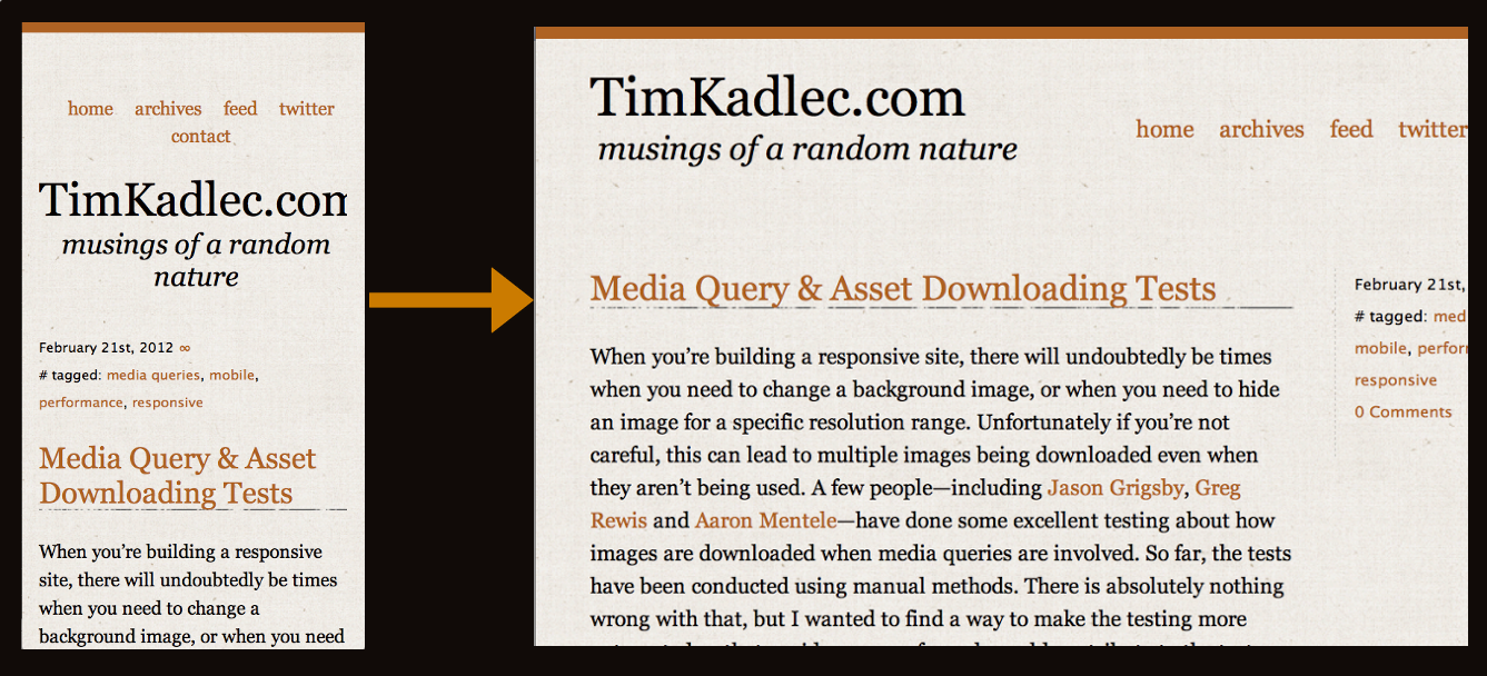
- Easy to implement - you can implement your large-screen site almost as-is.
- No Javascript dependencies - ensuring maximum compatibility
- No back-breaking CSS maneuvers required
- No tripping over your source order - no need to jump through hoops to shift nav lists around in the source. It flows au naturel.
Cons
- Height issues - Height matters in mobile. As Luke's book explains, content-first, nav-second is preferred for mobile web experiences. You want to get the users to the meat-and-potatoes content as quickly as possible. That means getting the navigation out of user's way so they can focus on the core information on the page. It can also be confusing when all the core content is cut off: [caption id="attachment_2713" align="alignnone" width="650" caption="The site doesn't look different from page to page and doesn't expose the core content soon enough"]
- Not scalable - What happens when you want to add a new section to your site? Where the nav fits neatly on one line now, what happens when your client says you need to add "products and services" to the nav? Or when you need to translate the menu to German?
- Fat Fingers - Cramming links too closely together can easily result in unwanted proximity clicks
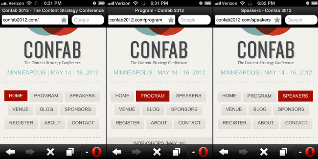
- Cross-device issues - While text might look great on an iPhone, devices have different ways of rendering fonts. Sites can look great on an iPhone but break when viewed on other platforms:
[caption id="attachment_2767" align="alignnone" width="650" caption="Responsive navigation breaking to multiple lines on small screens"]

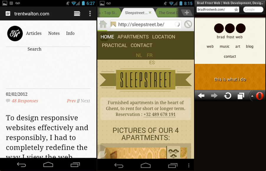
In the Wild
- [Yiibu
- [Trent Walton
- [Tim Kadlec
- [Ethan Marcotte
- Brad Frost Web
Resources
The Footer Anchor 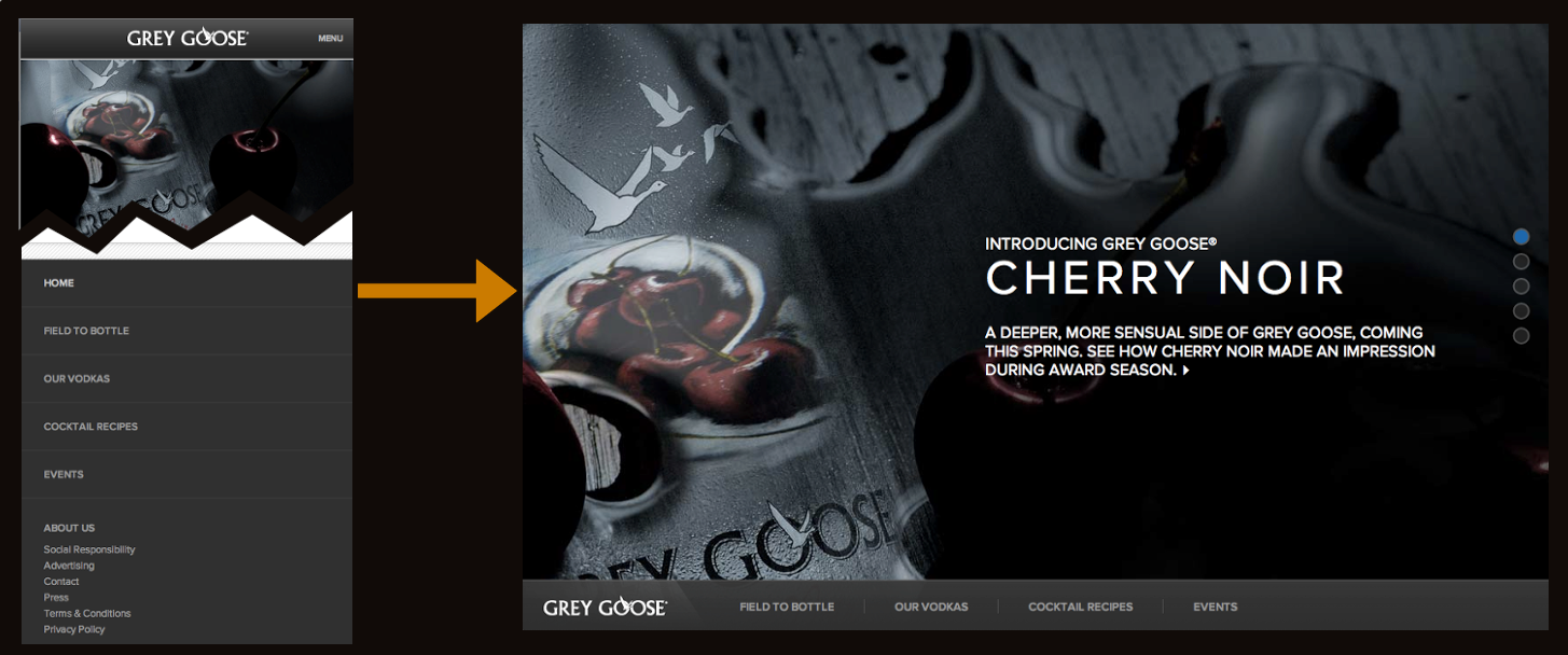
- Easy to implement - Simple anchor on top. Nav list on the bottom. That's pretty damn easy.
- No Javascript dependency - which means less testing and far better support.
- Little CSS work required to scale up - Thanks to absolute or fixed positioning, moving the footer nav up to the top for large screens is a piece of cake.
- Single button in header - A simple menu icon or link takes up very little room in the header, which frees up plenty of space for the core content
Cons
- Anchor jump can be awkward/disorienting - Quickly jumping to the footer of the site can be a bit disorientating.
- Not elegant - this seems weird to say, but other methods like the toggle method have a bit of sexy to them. A jarring jump, while awesomely practical, isn't the elegant interaction mobile users have gotten used to from interacting with those highly-polished native apps.
In the Wild
- Grey Goose
- Contents Magazine
- Bagcheck (I know it's not responsive, but it's where the technique was popularized)
Resources
The Select Menu 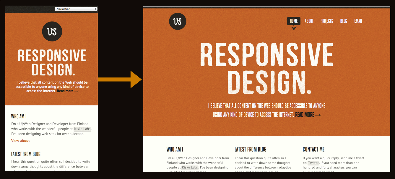
- Frees up plenty of space - a select menu definitely takes up a lot less space than a horizontal or vertical list of links
- Keeps interactions in the header - instead of a footer nav, the select menu keeps the navigation functionality in the header, where users are used to seeing web navigation
- Easily Recognizable - a select menu with a clear label saying "navigation" or "menu" is definitely easy for users to figure out.
- Pulls up native controls - each mobile browser will handle select menus their own way. Touch devices will pull up the nav in a touch friendly list, while trackball/d-pad/pearl devices will pull up a select menu more conducive to that particular input method.
Cons
- Lack of styling control - select menus are a pain in the ass to style. Each browser handles them in their own, usually clunky, way. Forget about cross-browser styling and coming out with anything that looks halfway consistent. As a result, the select menu can stick out like a sore thumb and really dirty up an otherwise good-lookin' design.
- Potentially confusing - Users are used to select menus in the context of filling out a form, but I'm not sure they'd grasp a form element out of that context. This is simply a hunch, so it would be interesting to test.
- Handling subnav items - nested lists handled by select menus can look weird. Child categories are usually handled by indenting with dashes, and while it might get the point across I see it as potentially confusing and a little ugly.
- Javascript dependency - It doesn't require too much JS to convert the list to a select menu, but it's worth pointing out simply because mobile browsers do the darndest things. But again, the technique is pretty cut and dry so there shouldn't be too many hang ups using this approach.
Resources
- TinyNav by @viljamis
- Convert a Menu to a Dropdown for Small Screens
- Progressive and Responsive Navigation
- Responsive Menu
In the Wild
The Toggle 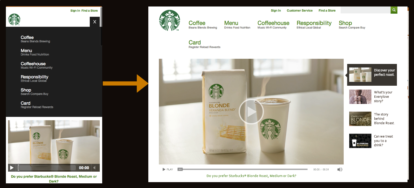
- Keeps the user in place - Where the footer anchor jumps suddenly, the toggle menu simply appears in place, which doesn't disorient the user.
- Elegant - This is definitely one of the more classy approaches. No awkward forms or page jumps, just a smooth animated flyout or basic show/hide.
- Easy to scale up - All you need to do is hide the mobile trigger and show the nav list when the appropriate breakpoint is reached and you have yourself a normal large screen nav. All this can be accomplished with CSS.
Cons
- Animation performance - Your mileage will vary when doing any sort of animation on mobile devices. Android is notoriously bad with CSS animations and so things might not be as smooth as you'd like. Also, for what it's worth I've recently been animating max-height which seems to work well.
- Javascript dependency - Again this approach relies on a bit of Javascript in order to trigger the toggle, but it's minimal. I have one Blackberry test device that refuses to listen to any of this stuff, but most browsers, including proxy browsers like Opera Mini and Dolphin Mini, handle it just fine.
In the Wild
Resources
The Left Nav Flyout 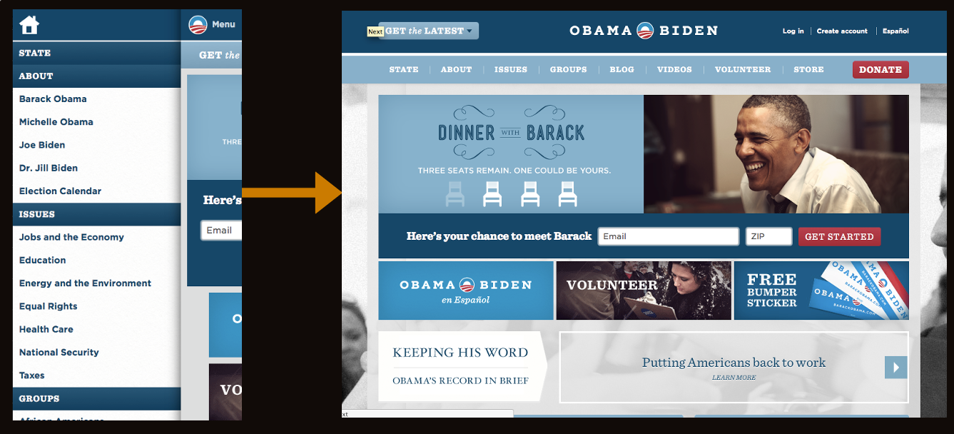
- Lots of space - While other nav techniques don't work very well if you have a lot of list items, this approach provides a lot of space to expand. I think that's why Facebook took to it.
- Good looking - This menu is very sophisticated and advanced, so it definitely has a wow factor to it.
- Facebook conventions - Facebook mobile users will be used to this pattern already since the web and native Facebook mobile apps utilize this left tray system.
Cons
- Advanced - While the other methods modify simple elements, this shelf method has a lot of moving parts. As Stephanie Rieger pointed out, the Obama site navigation broke on everything but the most sophisticated devices. If your project is meant for a broader audience, you want to be very careful if choosing this approach.
- Doesn't scale well - this method is quite unique to mobile and doesn't necessarily scale up to large screens easily. You can run a risk of essentially maintaining two separate navs for small and large screens.
- Potentially confusing - When I first saw Facebook's new mobile nav, I actually thought it was broken. Keeping a hint of the content on the right seems a bit weird to me, but this is all personal preference.
In The Wild
Resources
The Footer-Only 
- Frees up header space - It follows the content-first, nav-second model, but...
Cons
- Difficult to Discover - Users (both on small and large screens) might not discover there's a menu sitting in the footer.
- Difficult to Access - Mobile users have to scroll the entire way down a page (which might be very long) just to get around the site.
In The Wild
The "Hide N' Cry" 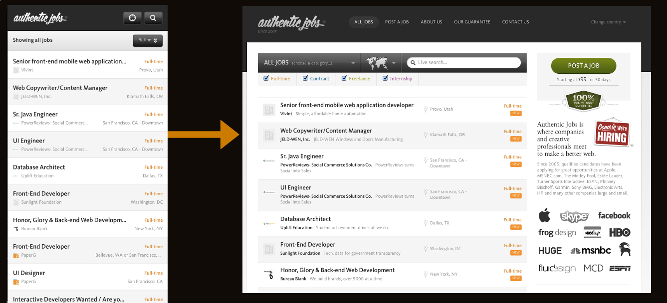
- Clears up plenty of space - By removing the nav for small screens, you free up a lot of space! But that comes at a cost...
Cons
- Removes content/functionality for mobile users - Hiding links and content is not OK. Responsive advocates say that responsive design removes many of the content disparities and experiential nightmares that can come from separate mobile sites, but if a responsive site is hiding content for mobile users it's no better.
- Adds extra page weight - Adding
display: nonefor elements that are presumably unneeded for mobile doesn't make it disappear. The code/images/whatever still gets download by mobile devices (which of course are more likely to be on slower connections). - Harder to maintain - Two separate navigations for small and large screens becomes a burden when maintaining the site.
In The Wild
- Authentic Jobs
- rourkery.com
- A previous version of the Obama responsive site
Resources
Considerations Ultimately, mobile navigation should be like a good friend: there when you need them, but cool enough to give you your space. A bad friend is someone who's not there when you need someone to talk to (when navigation is absent or hard to find), or someone who's obnoxious because they're always around and taking up space (dude, get off my couch). Finding the balance between accessible navigation and mobile screen real estate is an art that we're all trying to sort out. I'd love to hear your thoughts. Update Right after this was written, it looks like there's been some other great posts discussing responsive navigation. Check out:
- A Responsive Design Approach for Navigation, Part 1 by @filamentgroup Absolutely wonderful step by step guide to implementing the toggle approach.
- Pull Down for Navigation by @inspectelement, an clever approach that reveals the navigation as the user pulls down the top of the page. Quick pros and cons: Pros:
- Sexy as hell.
- Great use of screen real estate.
- Takes advantage of an existing smartphone convention of pulling down the top of the page to reveal more. Cons
- Potentially confusing - Mobile users are used to pulling down the top of the page to refresh a list of content items, not to reveal a navigation.
- Relatively Advanced - Right now the demo only is working in its entirety on iOS. I checked Chrome for Android, Android stock browser & Opera Mini and they all kind of worked, but not fully. I'm sure this solution could be progressively enhanced to accommodate more browsers.
- Explicit Instruction Required - you have to explicitly tell the user to pull down to reveal the nav, which is fine but could potentially be awkward in the site header. All in all these are minor points, but I'd love to see it working across more browsers!
Also, be sure to read about how to handle complex navigation for responsive designs.