Style Guide Best Practices at Beyond Tellerrand
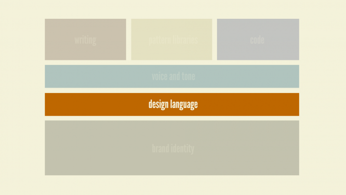
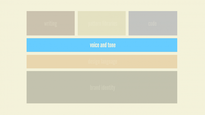
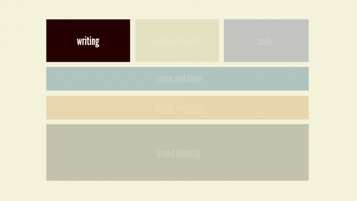
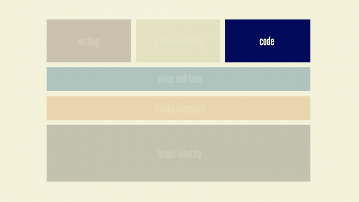
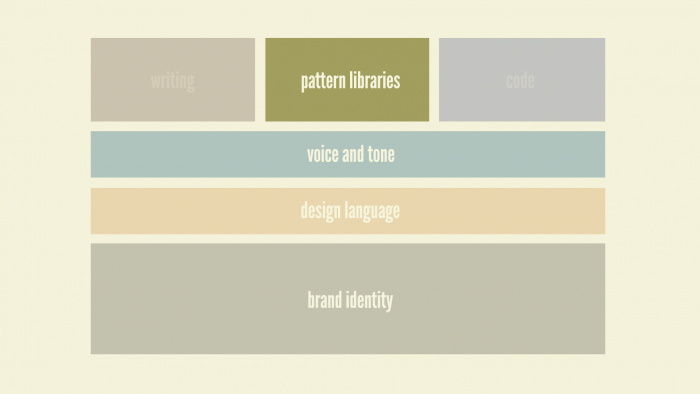
Brad Frost Style Guide Best Practices at Beyond TellerrandLast month I was in beautiful Berlin for the wonderful Beyond Tellerrand conference, where I had the opportunity to talk about style guide best practices and all that goes into creating and maintaining successful pattern libraries. Here's a video of my talk: The following is a (lightly-edited) transcript of the talk: So I'll just let this sink in. We'll call him Von Vapor. So this is the boss, and he calls up his team and says, "Great news! We just got the green light to redesign the homepage." And the team responds, "That's great news, boss!" "Yeah the current homepage is super ugly!" "And don't even ask about the code quality lol." "We're going to get a chance to do it right this time." "We're going to be using BEM." "All the visuals will be clean and flat." "We're definitely going to be looking into that whole React thing we've been hearing about." "Maybe we'll even use this as an opportunity to migrate to a new CMS." "Grunt." Von Vapor says, "Make it so" and gives the team the green light. This is what we do: we get a chunk of budget, we get some time, we do a project, and we lather, rinse and repeat. And we end up with maybe not the most consistent experience. This is Getty Images. I may have picked this example because I was looking for pictures of "vaping businessmen." But this is one example where they have a nice homepage and then you start going through the experience and start seeing that there's some holes in the continuity of the design. And as you click from page to page, you see it gets crazy. And this isn't that uncommon, as I'm sure you all know. We have scope issues that lead to these inconsistent experiences. We also have factors like geography. This is Canon's website. This is their global homepage. And then you go to their North American homepage. And then their Latin American page. And then Chile apparently has their own page for some reason. Then we've got Europe, India, Australia, China, Hong Kong, Taiwan. So geography is leading to all these different experiences. Then there's this guy, maybe the biggest jerk of them all: Father Time. Huge jerk. So you have a site like Ebay. You start off on the homepage in 2015, and then you click in and go back to about 2007, and then go a bit further and end up back in 2004, and then click a little deeper and end up in 1999. It's like some Benjamin Button shit. And then there are other issues. There's United, an airline in the US, and let's take a look at their buttons. Appropriately, that was Edgar Winter Band's 1974 hit, Frankenstein. 13 unique button styles on the homepage alone! That's crazy. So you're thinking "oh it's just these big organizations, big enterprises, big global companies", but small start-ups are guilty too. "We don't have time for cohesion and continuity." "Yeah we're too busy disrupting! We can't be bothered with this stuff." So this is the issue. People see you, your organization, your clients organization, as a single entity. They don't care that the designers and developers are on two different continents. They don't care that your'e using a Node stack on one part of the site and PHP on another. They don't care if you're Agile. They see you as a singular entity. It's our job, our responsibility as designers and developers to make more products, more services, more content, more functionality, available to more mediums in more countries, in more languages and locales, across more browsers, more devices, more environments, more screen sizes, more form factors, more contexts. Good luck with that. See ya later. Just kidding. So how do we manage to do this? How do we stay sane in this crazy, multi-device era whenever we're dealing with such large project scopes, disparate disciplines and all sorts of stuff? This is where style guides come in to help. The 6 Flavors of Style Guide There's actually a few different style guide types, so it's worth going over all of them to give you an idea of what they all mean and how they all work together. There's six general flavors of style guide, and I'll start with brand identity guidelines. Brand Identity Guidelines 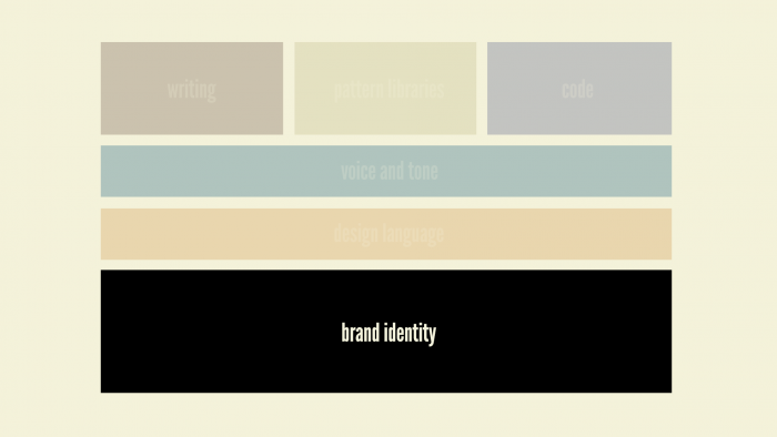
Making Style Guides Happen So how do we make these things happen? How do we establish pattern libraries in our work? Sell it Well, first thing is you sort of have to sell it. And you have to talk about the benefits of pattern libraries. The first and biggest one is that pattern libraries promote UI consistency and cohesion. Jakob Nielson said:
Consistency is one of the most powerful usability principles: when things always behave the same, users don't have to worry about what will happen. Instead, they know what will happen based on earlier experience. Jakob Nielson
This is tremendously powerful. Pattern libraries lead to faster production. Anna and I interviewed Frederico Holgado from MailChimp and they have a really fantastic pattern library. He talked about the notion of the "dark corners" of their app – things like legal documents and status pages that aren't actually priorities of their app.
We just copied and pasted a pattern, changed a few things, and in twenty minutes we had built a system that was responsive; it looked great on mobile and it was nice to look at. [The status page] was one of those pages that not a lot of people will see. We call them the dark corners. By having a pattern you could actually use that's already 95% of the way there, it brings up the quality of everything so those dark corners actually aren't so dark any more. Federico Holgado
By establishing this pattern library that they used the primary 4 screens of their app to create, and then used and reused those puzzle pieces they already established to light up those dark corners. Suddenly, all those pages that aren't a priority have a first-class look and feel to them. Pattern libraries establishes a better workflow between everyone involved in the project. The last speakers were talking about the importance of working together as designers and developers, and these pattern libraries definitely help establish this better workflow between designers and developers and business owners and everyone else. Pattern libraries create a shared vocabulary between everyone in the organization. Lincoln Mongillo used to work at Starbucks, and whenever they launched their new responsive site, they launched alongside it their new pattern library as well.
It is the common ground that designers and developers are all seeking…and I find that a style guide is really effective at providing that common ground. Lincoln Mongillo
The pattern library provided the common ground and the ability to all speak the same language and call things the same name. Pattern libraries make things easier to test. Lincoln again says:
Pattern libraries make what you change in production a lot more easy to manage over the long term; you're able to debug things more effectively. You have a view into how your code base is looking across a site versus having various artifacts show up across hundreds of pages. Lincoln Mongillo
You don't have to find every instance of a pattern. Instead you can test that pattern in isolation and make sure it's working well. Marci will talk later about accessibility at the pattern level. Steve and Mark were just talking about performance, so we can test the performance around a certain pattern and really hone in on that and optimize the performance around a specific pattern. Again, you don't have to hunt down every instance of something to find what your trouble spots are. Pattern libraries are a useful reference to keep coming back to over time , and they serve as this future-friendly foundation that you can live with, and grow with, and extend, and learn from, and test again, and roll those learnings back into the living, breathing pattern library. Show, Don't Tell So these things are awesome, and you can tell all that to your bosses and your clients. And they'll go "Eh, that sounds expensive. No thanks." So this is where showing, not telling is tremendously effective. The same way that Webpage Test gives you those timelines and videos to really hit people over the head with. The ability to takesomething like CSS Stats where you slap in your URL, hit the Go button, and it spits back all of your CSS selectors. You're able to go through and find the 45 unique colors that make up Facebook's web experience, and the 57 background colors. And you're able to show this to your organization and say "hey maybe we should clean this up. Maybe there's something we can do so that it's not so verbose." Another thing I find tremendously helpful is what I call an interface inventory. If you're all familiar with this notion of a content inventory, you comb through your entire site looking for all your unique content types, and you're rounding up what template it is, where it's going, who owns it, and stuff like that. It's a tedious process, but at the same time tremendously effective for establishing your scope of work as you redesign. Well, with an interface inventory instead of rounding up unique content types, you're rounding up unique interface patterns. Here's our good friends at United, and this is the start of an interface inventory for them. 
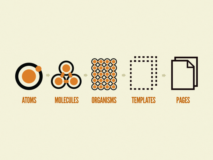
>): that's an include. So Pattern Lab's basically saying is "hey, I want to include an atom pattern called 'thumb'". Which is that little 400x300 image. So Pattern Lab is going to suck in that image, and now we have this little chunk of code and use that same greater than pattern to include that little chunk of code elsewhere. At the organism, if you take a look at something like a header – this relatively complex component – and you look under the hood of that, you'll see we have a `` tag and an include of the logo, an include of the primary navigation, and an include of the search form. And again using that same greater than technique, we're able to include the header anywhere we need it. So you can sort of see where this is going.It's kind of like Russian nesting dolls. Little things are included in bigger things which are included in even bigger things. Now when you get up to the template level, like the homepage template, you can sort of see a page start to come together. You'll see a few different patterns repeating themselves throughout the page, which are again just little includes of those same patterns, and we're wrapping those in a name so that we can latch onto later. And then at the page level, what we're doing is getting rid of the grayscale images and lorem ipsum text, and pouring in real, actual, representative content. So here's our homepage template, so at the page stage what we're doing is pouring in pictures of Beyonce. If there's one thing I learned on this project is that Beyonce is universally loved. So if you ever want to fast-track your designs, irrespective of what industry you work in or project you're working, pictures of Beyonce. So you can see, we have our picture of Beyonce, we have an ice skater, we have real headlines here, and you can see that we're swapping out those grayscale images with real representative content. And we're doing that by overriding some default data using some JSON, and we're saying "here's our hero image source, hero_beyonce.jpg" and that will wipe out that grayscale image and swap in the pictures we want. You can check out Pattern Lab, again it's open-source, I'm not here to sell you anything, but yeah you can check it out and play with it. We've been using this in our process, much like what Steve and Mark were just talking about, going from basic wireframes like this – this is as high fidelity of wireframes as we would use– and then jump straight into Pattern Lab code roughing out these basic patterns. This is a project we did for TechCrunch, redesign of their site, and we were able to say, "Great, this is a publication, so they're gonna have things like blockquotes and pull quotes and basic patterns that we're going to use throughout. So we were able to go very quickly from these static sketches into the browser, very early in the project. I'm talking like, the first week of the project. This is what the homepage looked like after about the first week of the project. It looks like garbage, but that's OK. What we were able to do was get into the final environment faster, so we're testing things like performance earlier, we're testing things like usability, ergonomics, and all those invisible aspects of the design that you just don't get when you're working in static tools like Photoshop and Sketch. And from a visual design perspective we were able to take this same modular approach. Dan Mall, who I got a chance to work with on these projects, uses what he calls element collages. Which are sort of similar to style tiles, if you're familiar with this notion of "here's some exploratory color palettes, and font styles, and things like that", but actually starting to apply those to an actual interface. You can tell that it's not a final, finished website. It's not there for approval; it's there to have a conversation about whether or not you're moving in the right direction. Eventually we would latch onto a particular organism, typically a header or something that's very visible, and we'd start having a play with that. We could show this to the client and start having a conversation about it. All the while, I'd be there in the background making revisions in Pattern Lab – in code – and do all our design iterations there. Dan and I would work together – he's the visual design working in tools like Photoshop – and I'm working in tools like HTML and Pattern Lab. We'd be moving together and manipulating things in the browser. He'd screenshot things and give them back to me. Stuff like that. So we'd end up in these weird situations where we'd have part of the site styled and done, and the rest of the page still looks like garbage. It's really only at this stage in the process that we started making comps. I think out of this entire TechCrunch project we only made something like 4 full comps. Everything else was handled in Pattern Lab in the browser, reusing those components. And that became our workflow. We were able to take these comps, have conversations with the client, and once we got the basic idea down – the basic direction down – then we'd take that, move it into the browser, and we'll do all of our tweaking there. So it became this really nice process, where designers and developers were working really closely together to come up with the final UI, but also leave behind and deliver to the client this final, finished, beautiful pattern library. And we handed it the the client, and we're like "Here you go! Goodbye. We've done our jobs." And they lived happily ever after. Or did they. As it turns out, making a pattern library and spending all this time being very thoughtful and deliberate in establishing the pattern library results in "ah this is great" and they just chuck it into the trash can right next to the Photoshop documents and PDFs. Thanks. So that's sort of depressing. Maintaining Style Guides This is the issue. I think that this is the really fundamental shift that I think we need to take away here, is that this is how we've been used to thinking about our work. We tend to think, "Hey, we're designing and developing a website." And then we've got this little style guide that's sort of hanging off the side that is some documentation about that website. But you can sort of see what can happen there, right? It becomes too much to maintain, it gets behind schedule and you get busy withe next version of the site, and you don't have time to update the pattern library. So it sort of dies on the vine and becomes obsolete very quickly. This is an issue. What I think needs to happen instead is this.Instead of thinking "we're making websites" we need to say "we're making design systems that are making that website". The website is one instantiation of our design system. That is a fundamental shift that I really think sets you up for long-term success because it forces you to go through your design system in order to make updates and changes to your site. Nathan Curtis (@nathanacurtis) has done a ton of great thinking and writing on the topic, and he says:
A style guide is an artifact of design process. A design system is a living, funded product with a roadmap & backlog, serving an ecosystem. Nathan Curtis
So how do we make these things not just useful whenever we hand them off to our clients or get done with our sprints of whatever, but really make them long-term success stories? Make It Maintainable There's this concept of the Holy Grail, and this is something that anyone that's been talking about pattern libraries has been pursuing. What we want is this magical setup where we have our pattern library with all of our Lego bricks that make up our final website, and if we make a change to one of those Lego bricks, anywhere that Lego brick is included will just magically update. That is awesome. Very very few people have made this idea come to life. Ian Feather and his team at Lonely Planet have done exactly this. They created their design system, wrote an API for their pattern library, and their production environment eats their pattern library. Which is amazing. And what this allows them to do is crank out new pages and new features all the time. They can make tweaks, make performance tweaks, make accessibility tweaks, and they'll just roll out automatically to their production environment, which is amazing. Now something I've been doing in my own workflow, although it's not as hardcore as that, is using Grunt to make changes to my CSS inside of Pattern Lab, it automatically copies that over to my Wordpress theme or whatever the production environment is. Any time I make a change to my JavaScript it bounces it over to my production environment. And the big challenge is finding the bridge between the patterns themselves – the actual markup – and the production environment's patterns or includes. It's definitely not impossible, but it takes some thought and set up, and it's well worth your time. Make it cross-disciplinary How else can we make these things long-term success stories? Make it cross-disciplinary. These things have the potential for being that watering hole that everyone gathers around to talk about, to facilitate that communication and collaboration that's so incredibly necessary to do good work. This is Walmart's website. We were just out in Portland Oregon hearing from their team about all that goes into making these hero units, and it involves hundreds of people, hundreds of hours, all these meetings, and all this stuff. You have business owners with their own concerns, you have project managers, product directors, art directors, UX designers, front-end developers, back-end developers, all with their own unique considerations and worries, just around one component. So again, these pattern libraries create this hub that people can gather around and have those conversations. Make It Approachable In order to make it cross-disciplinary, they need to be attractive looking. This sounds like a no-brainer; well-designed things will get used more. So taking the time to create these good-looking, approachable style guides lead to more people using them. They become more valuable. Make Them Visible
When you place style guides behind constraints, teams either take an outrageously long time to get access, or they never get access. Nathan Curtis
Make them more visible. A lot of times big organizations are like "oh my god these need to be our best-kept secret. We have to keep this on lockdown, behind some log in." And Nathan says whenever you start doing that, people either don't get access to them or take forever for them to get access to them. Back to the Starbucks style guide. They didn't have to release this thing to the public. They didn't have to put it at a publicly-facing URL, but they did. And I'm so incredibly thankful they did because that really did set off an avalanche of other people starting to publish theirs. And this gets into something I talk a lot about giving stuff away or giving away your secrets and all of that. A lot of those concerns are unjustified. Whenever Anna and I started interviewing people for our podcast about style guides, every single guest came back to this notion that their style guide serves as a huge recruitment tool.
When I saw Salesforce’s style guide I thought it was beautiful and it's why I wanted to join this team. Jina Bolton
Jina Bolton, who's one of the most amazing Sass developers on the planet, saw Salesforce's style guide and was like "I need to work there." And now they've done all this great work like the Lightning Design System, and it's like holy shit, talk about worth their while. Make It Agnostic Pattern libraries should be agnostic. It's hard to get out of the context. We say "oh that's a product item" or something. It's really easy to get tunnel vision and focus on where our UI patterns get used. But it's more helpful and creates more versatile patterns by naming things very generically, with names like "feature block" and stuff like that. This is tough, as you all know. If you've ever tried naming a Photoshop document or CSS nomenclature or anything like that, naming things is tremendously difficult. What I've found to be really helpful is to take a component, and blur out the contents of that thing. And then ask "what is that?" That's a helpful exercise to help you focus on the structural elements rather than the content that goes inside it. Make It Contextual Show what patterns make up a specific pattern. Show where that pattern gets used. Just showing this little piece of interface is great and all, but where is this thing actually being used? With Pattern Lab, because we have that Russian nesting doll approach, we can actually track where each pattern gets used, which makes it really helpful to go back through. If you were to make a change to that pattern, you can go "oh ok, now I need to retest the profile nav, the section media list, the account settings, and the account edit settings to make sure nothing broke. That's hugely helpful. Make It Last This is not a one-and-done thing. This is not just a static artifact. This should be a living, breathing entity. I think things like Material Design are really fantastic and fascinating because they publish these updates. "Here's what's changed. We added this thing or we removed this or tweaked this thing." And that helps keep people in the loop, helps keep people interested, and reaffirms that "yeah we're behind this project and this is still active, and oh by the way have you used it today?" The digital team at Marriott send out a wonderful monthly newsletter that goes through the same stuff. Here's what was changed, here's what was added, here's what just got launched with it, and so on. Really fantastic. I like to joke around and say pattern libraries and design systems are like a fine wine; they increase in value as time goes on. The more you make it part of your workflow, the more you make it work for you, the more it's going to pay dividends in the long run. It's very much worth your while to set it up initially, and even more worth your while to make sure that it stays relevant and a core part of your workflow. If you're interested more in this I'm writing a book on the topic called Atomic Design that I'm writing in the open. You can preorder the ebook for $10. Thank you very much; I appreciate it. I give workshops all about atomic design and creating effective interface design systems. If you're interested in having me in to work with your organization, feel free to get in touch. *[DETAILS]: Device, Environment, Time, Activity, Individual, Location, Social *[RESS]: Responsive Design with Server-Side Components