Earlier this year I had the amazing opportunity to create a responsive site for TechCrunch. I got shot out of a cannon at the beginning of 2013. I had been contemplating going out on my own for a while, so I decided to reach out to the great Josh Clark for career advice. In addition to providing me a ton of great advice, he asked if I'd be interested in working on a potential project that was in the midst of coming together. Of course my answer was yes, and for the next few months began working on a redesign of TechCrunch. The Team I had the honor of working alongside some of the smartest and nicest people I've ever met on this project (and thankfully most of us ended up working on Entertainment Weekly right afterwards). Here was our crew:
Josh Clark steered the ship. He got the team together, led the design process, constantly managed the client relationship, and gave off positive vibes that carried us through a lot of long nights.
Jennifer Brook is an absolute beast. Never before have I seen someone conquer content and information architecture so adeptly.
Dan Mall led visual design on the project. Dan constantly amazed me at how thoughtful, utilitarian, and gorgeous his designs were. It was an honor to work with him.
Jonathan Stark slung some serious JavaScript. It was my first time working with a bonafide JS expert, so I did my best to learn all I could from him. He also helped me with my abysmal Git/Github skills, and for that I'm eternally thankful.
Kristina Frantz brought to the table some serious project management chops, which were essential in managing our entirely remote team.
Our friends at TechCrunch included leadership and input from Christine Ying, Ned Desmond, Nico Vincent, Jon Orlin, Alex Khadiwala, Eric Eldon, Alexia Tsotsis, and Matt Burns. Luke Gedeon, John Bloch, and Eric Mann from 10up did a phenomenal job with the the Wordpress integration.
As for me, I coded the HTML and CSS for the site. As it turns out, there was a lot to create, so thankfully Pon Kattera and Greg Sarault stepped in and helped me prototype a ton of stuff. I most certainly couldn't have done it without them!
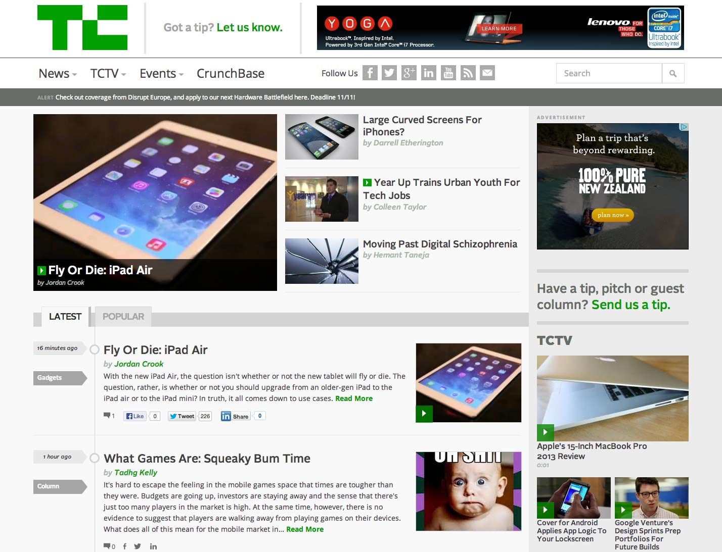
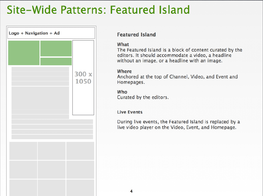
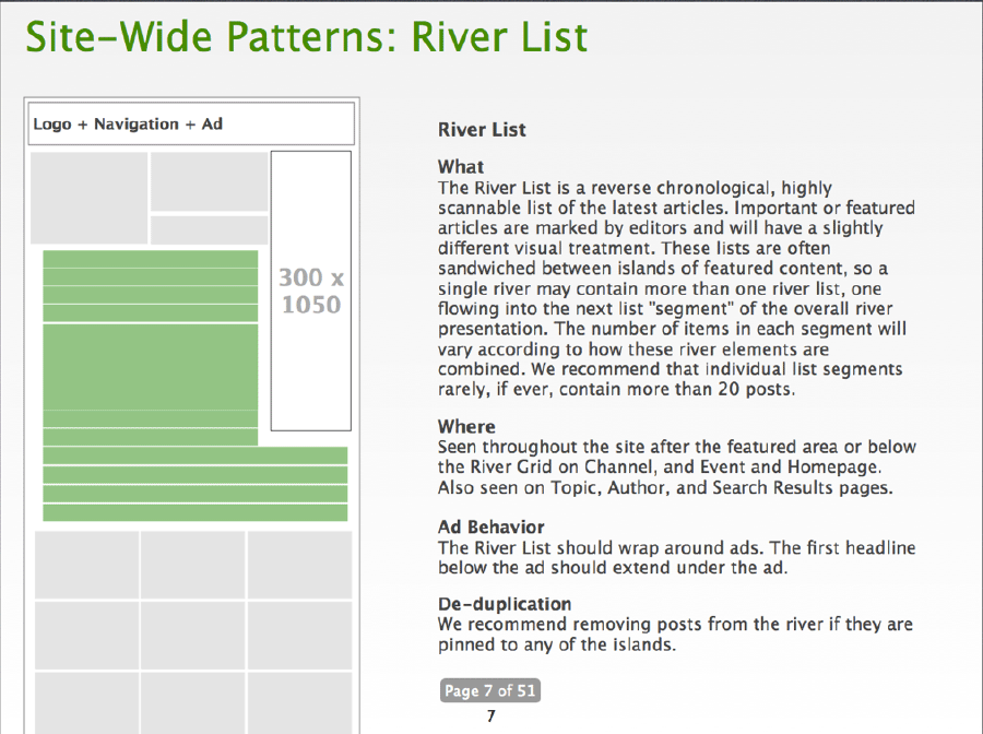
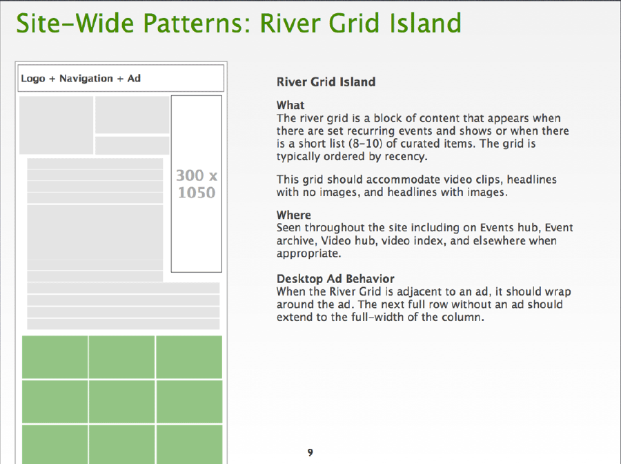
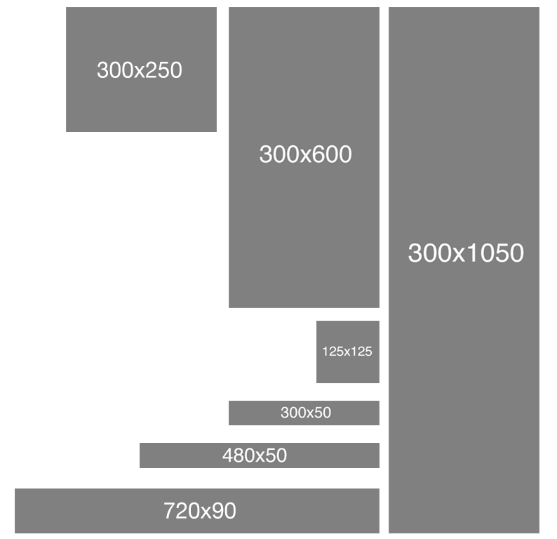
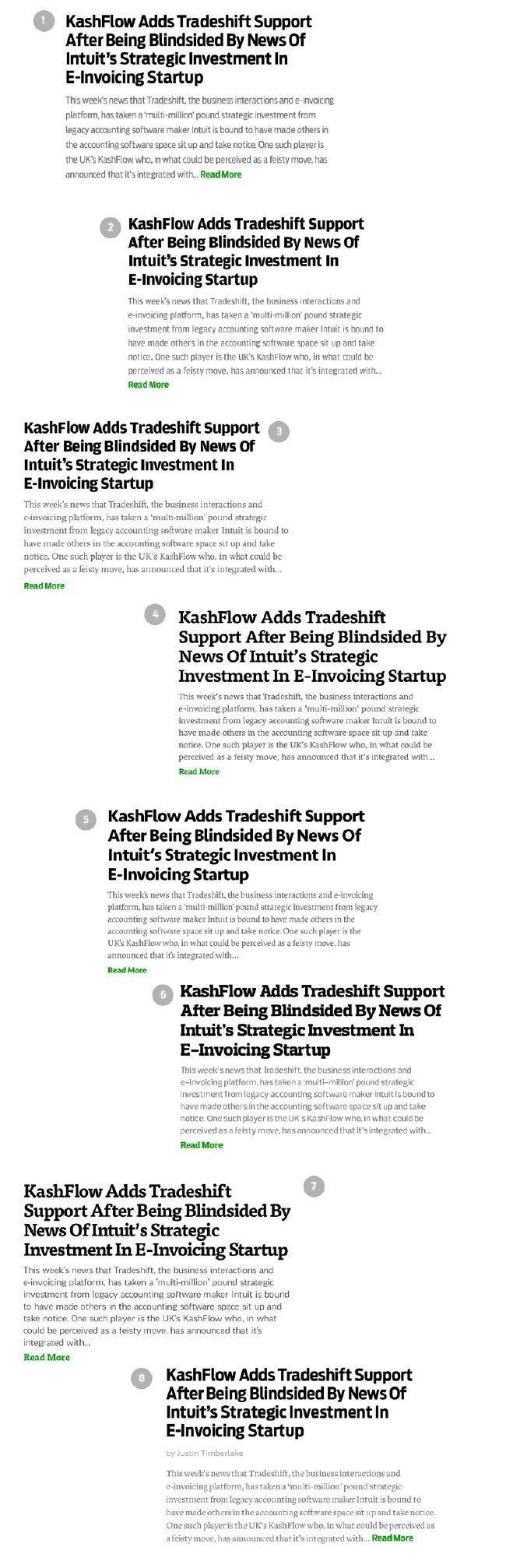
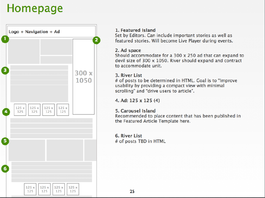
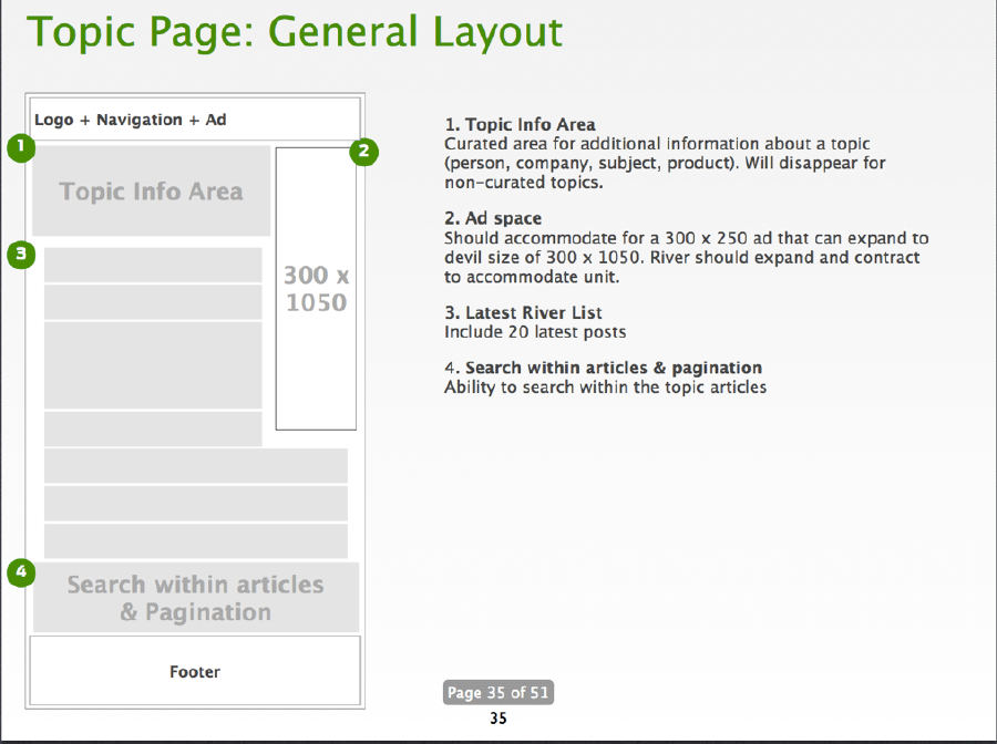
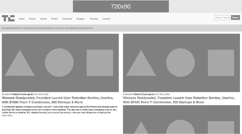
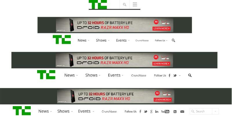
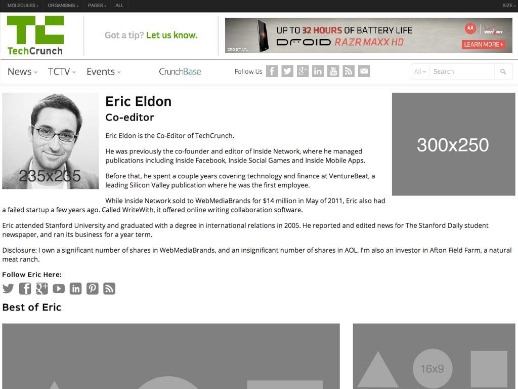
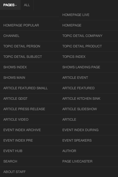
We all worked remotely, and since the majority of the team were also frequent speakers we found ourselves collaborating on this project while criss-crossing the globe. Our calls would start with "Greetings from Stockholm!" "Greetings from Chicago!" "Greetings from Sydney!" It was pretty wild, but hey, we got the job done. The Process Our merry group of makers had the opportunity to revisit what the modern Web design process looks like, and this post is going to step through how we did things. Set expectations **A lot of the failure to move into thePost-PSD Era has been a problem of setting the right expectations with clients and colleagues at the beginning of the project. ** We did our best to help the client understand the reality of the Web landscape, and that because our website was going to be fluid, our process needed to match. ](https://github.com/opensourcedesignis/opensourcedesignis.github.io) We helped everyone understand that development is an essential part of the design process. A few months before starting the TechCrunch project, I was deep in my thoughts working out what would ultimately become atomic design. I had even begun work on a tool that would allow me to establish a robust pattern library and stitch together interface patterns to form pages. That tool would eventually evolve into Pattern Lab. I introduced everyone to atomic design and demoed Pattern Lab for them. We talked about the benefits of creating a robust design system versus an ad hoc collection of page templates. Everyone seemed to get it without any wailing or gnashing of teeth. Kickoff and Planning We kicked the project off at TechCrunch's office, where we conducted stakeholder interviews, did a 20-second gut test, and design studio exercises to get everybody aligned. You can read more about the exercises because we repeated these effective exercises for Entertainment Weekly, and I used them for my current redesign of the Pittsburgh Food Bank website. Sketching Armed with insights from the kickoff meeting, we retreated back to New York to comb through the site, establish content types, talk information architecture and brainstorm interaction design together. After that Jennifer rolled up her sleeves and got to work organizing the mountains of Post-its and sketches the group had generated. Establishing Site-wide Patterns Jennifer did a hell of a job setting up some global patterns for the sites, establishing what she referred to as "rivers" and "islands". Rivers are lists of objects like news stories, while islands were featured content areas. The great thing about establishing these site-wide patterns was that I was able to immediately represent these patterns as organisms in Pattern Lab. Because of the blocky, gray-scale nature of Jennifer's sketches, I was able to quickly recreate all the sketches in HTML using a simple .fpo class. Once established, creating and modifying wireframes was as easy as copying and pasting an include. In addition to translating Jennifer's sketches into FPO blocks in Pattern Lab, I was able to get to work right away on a whole slew of molecules and organisms. Just by looking at TechCrunch's existing site I knew I could roll up my sleeves and start marking up a whole host of things: text elements (bold, emphasis, blockquote, pullquote, etc), image types (logo, post image, avatar, etc), forms (search, newsletter, submit a story, contact, etc), ads, and a whole lot more. [caption id="attachment_7096" align="alignnone" width="794"] We knew that ads throw in a monkey wrench into a responsive sites, so I created FPO ad unit atoms and chucked all the ad requirements into the HTML wireframes right out of the gate.[/caption] Establishing Visual Direction While Jennifer was working on information architecture and I was setting up molecules and organisms in Pattern Lab, Dan was hard at work establishing visual direction. Because TechCrunch is a destination for people to read, Dan thought a logical place to start exploring would be type. So using Typecast, he created some type combinations to facilitate conversation with the client. The client was able to comment on type ("That's too blocky" or "Number 3 is a little too thin") by looking at real type displayed in the browser, the same place where their users will ultimately be experiencing the site. Rolling Up Our Sleeves Once we had a solid sense of information architecture, visual direction, and HTML scaffolding, we were able to really get into the weeds to start designing things. HTML Wireframes Jennifer blocked out all of the different page templates, accounting for variants of a template (such as how the homepage looks during a live event versus a normal news day). And I was right there behind her creating each page template in the browser, which consisted of the appropriate molecules and organisms. Slowly but surely, I started replacing those FPO divs with marked-up molecules and organisms. Now, these initial HTML wireframes looked absolutely hideous. But that's alright because at this stage in the game I was just getting everything wired up. Layout, color, and other visual design-related stuff would come later. Element Collages Armed with insights from type and branding explorations, Dan went to work creating element collages of the interface. Element collages are a bit more tangible than a style tile, but still not a full-on comp. Here's one that demonstrated how things might adapt across multiple screen sizes: The great thing about this is that he didn't have to worry about what the footer or featured post area was going to look like in order to get the client's feedback. By honing in on one organism rather than a whole page, the client was able to focus on getting the header right rather than getting distracted by what FPO image Dan might have decided to use on a homepage comp. Element collages allowed us to have the right conversations at the right time. Once the client was comfortable with the header direction, I would take that direction and start styling it up. I started with the global header and footer: Now this is where things start getting weird, because what began their lives as HTML wireframes were slowly transforming into the final designs. I thought this would be awkward from a client relations standpoint (we certainly had a lot of internal conversations about how to address this), but ultimately because they were involved in the process the entire way they understood what was going on. Because they had a better perspective on where the design was coming from, we were able to get feedback on certain components despite the fact that the rest of the site guts still looked like grayscale throw-up. Comps Believe it or not, we did indeed create a few full comps. Gasp! Horror! But the difference between this and all the other projects I've ever worked on is that we didn't lead with the comps. By the time Dan made some comps (for the homepage and featured article page), we had established many of our key molecules and organisms, and had an understanding of the systematic nature of our design. We presented the comps to the client, and they'd come back with some (usually) minor change requests. I'd then take the comps and their feedback and make the requested changes in the browser, so that we weren't dwelling in Photoshop any more than we had to. Dan and I would Skype and chat through the issues to ensure the initial vision remained intact. Behind the Scenes Photoshop And so it went. We'd create visual styles for particular organisms, and design full comps if absolutely necessary. I would style each organism appropriately, and slowly but surely replace the remaining grayscale blocks with detailed styles. Sometimes things just weren't looking right in the browser. Maybe a few components didn't not look quite right sitting next to each other. In these instances, I'd bring them to Dan's attention, who would screenshot the working code and shift things around to solve the design problem. We'd talk about it and I'd get back to work implementing his suggestion. After a while, we realized that a whole lot of the Photoshop documents being created weren't ever intended for the client to see. Instead, these little Photoshop hotfixes were created to help me style things better in the browser. Strange days indeed. The Final Push We worked hard styling each of the templates, and addressing every variation in a template. What does an article look like when there's zero comments? What about when there's 60? What does a topic page look like for a product versus a company versus a person? What does an event page look like before, during, and after an event? We created a new page for each template variation. Here's what the final page list looked like in the Pattern Lab menu: That's a lot of pages. Once the templates were complete, we cross-browser, cross-device tested everything (we had been testing on different browsers and devices throughout, but only on a subset during core development). From the design end of things, Dan went through and created an incredibly detailed list of minor design tweaks that tightened things up and got things ready for final delivery to be implemented into their Wordpress backend by the fine folks at 10up (who by the way were involved throughout the course of this process). What was great is that we weren't just handing over a bunch of templates, but rather an intentional, robust design system that can be built upon and evolved. After some time the site went live. It was a long few months, but I think our hard work paid off. Lessons Learned So that's that. Here's some things I took away from the project:
It's not Agile –So we didn't do the traditional waterfall approach. So we must have been Agile right? I don't really think so. I think there's a false dichotomy between waterfall and Agile, but at the end of the day I don't know what I'd call our process. All I know is that we communicated a lot, collaborated like I've never collaborated before (keep in mind that we were all remote throughout the entire process), and we were honest with ourselves and the client.
Work in parallel –There's so much work that can be done in parallel. From day one, information architects and content strategists can begin organizing information, visual designers can start exploring type, color, and texture, and developers can set up tools, patterns, and components. As some point in the process, a discipline might serve more as consultant for the other disciplines, while other times they're burning hot creating things. As time goes on, the creating/consulting role shifts, but no one is ever fully out of the picture.
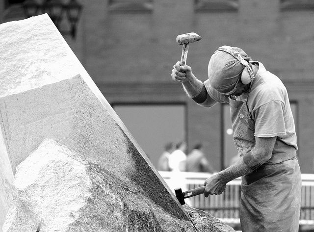
Slowly build fidelity –This process reminds me a lot of subtractive sculpture. You start out with a big slab of rock, and slowly chip away to get the rough shape of the form you're creating. You take another pass at it to get a better sense of the object you're trying to extract from the stone. You take another pass to start getting a bit more detailed. Eventually, you start honing in on a particular aspect of the form: a face, the arms, or the torso. Slowly but surely you detail each section of the sculpture until you've arrived at the final form. Only unlike stone sculpture, we have Cmd+Z.
There's a lot more to be said about this project, and hopefully I'll get the opportunity to explore them further. In the meantime, check out the site, and look out for more posts from the rest of the team.
*[DETAILS]: Device, Environment, Time, Activity, Individual, Location, Social
*[RESS]: Responsive Design with Server-Side Components