We see the phrase 'mobile first' everywhere. Luke Wroblewski definitely struck a nerve when he coined the phrase a few years ago and created an important battle cry as we head into this multi-screen future. Luke's definition of mobile first consists of three core components:
The growth of mobile is a huge opportunity to reach more people than ever
The constraints of the mobile medium force us to focus on what really matters
The capabilities of mobile create opportunities to innovate
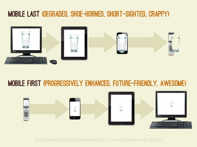
However, sometimes terms evolve beyond their initial definitions and become a catch-all for a general notion or idea (I've recently been talking about this with regards to responsive web design). This genericization has certainly happened to 'mobile first' and as a result we're seeing it used in myriad different ways. Here's the various flavors of 'mobile first' I've come across. Culture The mobile-first population primarily (or only) accesses the digital world through their mobile devices. Mobile reaches 87% of the world's population, and is more pervasive than any other mass medium. In fact, more people have access to mobile phones than to running water. Mobile-first web users are on the rise as well. 31% of US citizens use mobile devices as their primary way of accessing the web, and that figure is much much higher in other regions. The term 'mobile only' is also emerging as a cultural term, which describes when a mobile device is a person's only lens to the connected world. [caption id="attachment_4281" align="alignnone" width="650" caption="A mobile-first generation"][/caption] 'Mobile first' in the cultural sense can also refer to the fact that for many people, especially babies and young children, a mobile device is often the first connected device they interact with and become familiar with. This mobile-first mentality shapes how they interact with the world and creates expectations for everything around them, including non-touch devices and inanimate objects, to be intuitive, touch-friendly, and always on. These mobile-first minds are unencumbered by mental models from computing's past, and as a result will certainly shape what we expect from our connected world moving forward. Strategy Because all roads are currently leading to mobile, many companies are shouting "Mobile First!" from the rooftops of their organizations. What does this mean? Typically this means making mobile a priority instead of an afterthought in order to capitalize the growth and capabilities of the medium. Mobile-first success stories like Instagram has triggered many startups, products and services to lead with mobile apps and products, instead of treating mobile as an enhancement or tack-on. Organizations believe focusing on mobile provides an opportunity to skate to where the puck is going instead of to where the puck has been. 'Mobile first' in the strategic sense is also incorrectly used in the context of the 'native vs web' 'debate'. What digital strategy should an organization lead with: a mobile app or a website? 'Mobile first' in this context is synonomous with 'native first'. This debate creates a false dichotomy between two different platforms that do different things, because both are indeed accessed on mobile. While ultimately it may make sense to lead with native mobile apps or create a mobile-specific product or service, a misunderstanding of 'mobile first' can lead to a myopic strategy that can cause organizations to miss the big picture and miss out on future opportunities. Design As Luke handily describes in his Mobile First book, the constraints of the mobile medium force designers to focus on what's truly important to a product or service. When you lose 80% of your screen real estate, all the extraneous bloat that tends to finds its way onto large screen designs doesn't seem so attractive or necessary anymore. Mobile provides a great opportunity to reevaluate what content/functionality is necessary and gives us an opportunity to strip away the cruft across the board (and not just for mobile users either). These constraints also encourage ease-of-use, intuitiveness and speed as essential ingredients to a good user experience. This mental shift in design strategy has designers wire-framing, Photoshopping, prototyping and presenting on small screens first. Establishing how a core experience fleshed out on small screens can translate up to larger screens can be more logical than trying to cram large complex desktop designs onto small screens. Development Mobile-first development can encompass many things and in the web world the term is often discussed in the context of mobile-first responsive web design. The basic idea is that instead of coding a large screen web experience first and then adding additional code in order to work on smaller screens, it makes more sense to author a lightweight semantic core foundation first then progressively enhance the experience from there. Structure Structured content-first means authoring a core foundation that prioritizes clarity, semantics and performance. It's used as the foundation with which the rest of the experience will build upon. Instead of including large heavy modules by default only to have to hide or disable for small screens later, a mobile-first foundation makes it possible to introduce large-screen-appropriate elements later while still providing a fully accessible experience. Style Mobile-first styles mean establishing shared CSS styles first and only introducing larger-screen-specific styles only when appropriate. Here's a quick example from my mobile-first responsive web design tutorial. First, the desktop-first approach that we want to avoid:
Basically what we did is wrote layout-specific rules only to undo them for smaller screens. This adds unneeded complexity, so let's accomplish the same result in a mobile-first way:
Instead of authoring rules only to override them for small screens, it makes more sense to only introduce layout rules when they apply. Mobile-first styling results in smaller, more maintainable and easier-to-read code. More to Come The rise of mobile has already reshaped the world, opened up new dimensions of interaction and forced us to rethink how we create digital products. It's incredible, and it's just the beginning. As 'mobile first' continues to pervade even more aspects of culture and design, it's only a matter of time before it becomes the default mode of thinking. Thanks, Luke!
*[DETAILS]: Device, Environment, Time, Activity, Individual, Location, Social