The Mobile Case for Progressive Enhancement
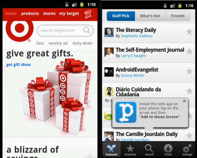
Brad Frost The Mobile Case for Progressive EnhancementI recently read a fantastic reminder to progressivly enhancement for Javascript. Jack Bishop and I gave a presentation at BK.js a few weeks ago about progressive enhancement for the mobile web (thanks Marco Carag!) During the Q&A;, someone asked "With all this diversity and inconsistent/shaky support for this Javascript for mobile browsers, why don't we just rely more on HTML?" EXACTLY. Yet it was asked as a question. There's a mentality that in order to do create functional experiences in the browser, especially for mobile, you need to use some hardcore JS framework, rewrite the scrolling logic, add a bunch of interstitial animations, create overlays and add swipes. I have nothing against frameworks or these techniques, but for whatever reason people think they're a prerequisite for creating mobile web experiences. They're not. One of my favorite mobile sites is Target (great job Matt Menzer). The beauty of this experience isn't in the mind-blowing animations, it's about the clarity of the content, the speed in which the page loads and the accessibility of the experience. Contrast Target's mobile experience with Paper.li's mobile experience. In case you're not familiar with Paper.li it aggregates links from social sites and creates a digest. The focus should be on the content, but instead the focus rests on a very complex system of loaders, scrollers, fixed position elements and native-feeling UI elements. Note: it may not seem bad on a desktop or iPhone 4s, but try firing it up on an Android, Windows Phone, or Blackberry. Another note: this was made with Sencha Touch, which again I have nothing against (quite the opposite), I just feel it's better suited for hybrid apps that aren't deployed over the web. The difference between Target's and Paper.li's sites is that one is working with the constraints of the medium and using those constraints to it's advantage, while the other is introducing unnecessary dependencies on what's essentially a list of links and limiting the site's accessibility as a result. [caption id="attachment_2234" align="alignnone" width="650" caption="Target and Paper.li's mobile websites."]