The Overflow Pattern
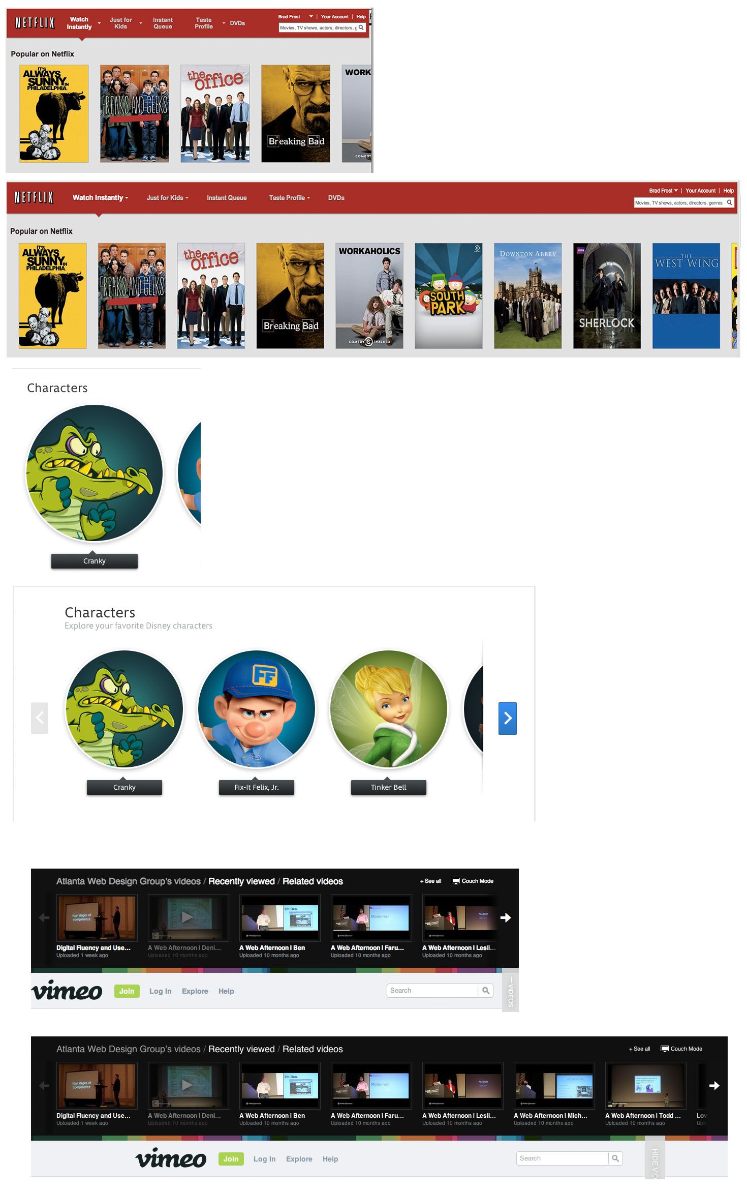
Brad Frost The Overflow PatternThe overflow pattern is a technique used in fluid web designs to expose more content as screen real estate becomes available. Typically seen in carousels and data tables, the overflow pattern allows content to remain compact for small screens while still capitalizing on additional screen real estate. 

- Make it obvious - Many users won't know more content exists unless you provide explicit hints or controls. Use arrows, scrollbars, gestural hints, overhangs and/or timers to inform the user that they can view more content.
- Only load what you need - This is an obvious point, but it's worth stating anyways. If you have a carousel with 45 items in it, please don't load all 45 by default. Many (or even most) users won't even see the second page of carousel items, so don't force them to download extraneous assets.
- Treat touch as an enhancement - A swipe can be an elegant way for a user to peruse a carousel's content, but don't leave non-touch users out in the cold. Make sure content is always accessible no matter how a user accesses the web.
In the Wild
- Skinny Ties - a product carousel of that exposes more ties as screen real estate increases.
- Disney - Disney's carousels use the overflow pattern and implement an overhang to let users know that there's more content to be had.
- Blackpixel - the "meet the team" section.
- Quartz - the topic chooser in the header utilizes the overflow pattern, however I'm not convinced that the fadeout at the edges is explicit enough. It may be intuitive enough for touchscreens, but it's definitely not obvious for mouse users to click-and-drag.
- Wikipedia's Mobile Site - Wikipedia's data tables on their mobile site uses the overflow pattern to reveal additional table columns.
Demos and Resources
- Responsive Tables (2) by Dave Bushell with accompanying demo
- 3-up Carousel - A carousel that shows one panel on smaller screens, and reveals three panels when space becomes available.
- Overflow Carousel - a simple demo using
overflow-xto create a horizontal overflow on a list of content items.
*[DETAILS]: Device, Environment, Time, Activity, Individual, Location, Social