The UX of login codes
Brad Frost The UX of login codesI could do a deep dive into the UX of login codes, but I'll do my best to keep it short. If your product texts/emails login codes, the experience better be amazing. 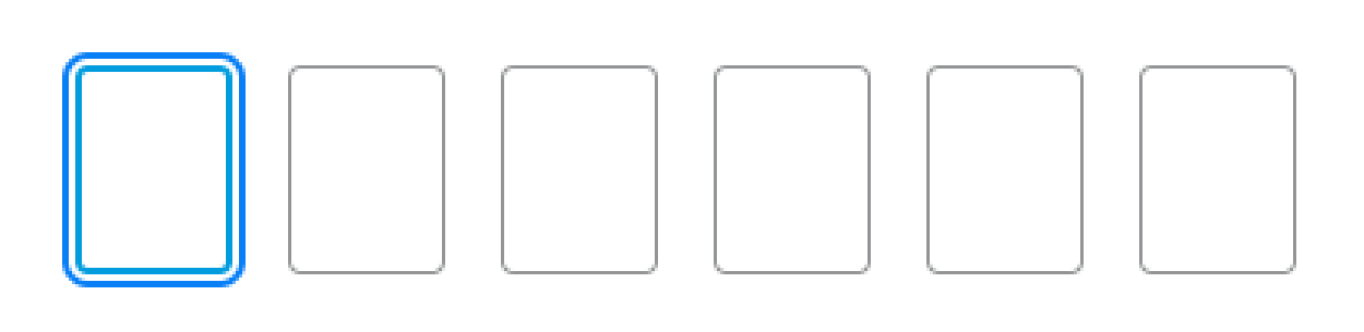
- The text/email never comes. You find yourself in limbo and eventually have to go fishing for the "Didn't get your code? Resend it." link.
- The messaging around the code is long, obtuse, or weird. There's an irony when codes arrived wrapped in messaging breathlessly talking about spam/phishing/security that ends up making the whole thing feel suspicious. Lots of opportunities to mess this up: unclear subject lines, code buried in text, code not stylistically differentiated from the rest of the message, and so on.
- The affordance is weird. I'll say it: I don't like the pattern where each digit is its own text box. It's an affordance that's supposed to make things clearer, but it doesn't (for me at least). Can I paste? Where do I paste? Is my paste going to carry over into all of the little boxes? Half the time there's a dash in the code; does that get included? I'm a professional designer and this trips me up; I wonder how non-designer people feel about this.
- The code is cryptic and weird - Numbers, alright. Alphanumeric code, sure. 12 digits with special characters? Feels like performance theater and just makes it weird.
- Can't copy-and-paste the code - This happened to me twice today, which is what prompted this little grumbly post. The lack of copy and paste results in this awful dance of switching between apps while trying to hold random digits in your head. Woof.
Better
- The code arrives promptly. No sitting by your inbox twiddling your thumbs; it shows up right away.
- The messaging is clear and concise - 95% chance I'm not going to read this text, so reduce copy (or better yet, remove entirely!)
- The code stands out - My mind is primed for "code code code code code" so making the code stand out is great. Android messages surfaces a nice "copy 434345" button that makes texts a lot easier. Emails should use formatting and other basic design practices to make the code stand out.
- You can easily copy and paste - There's a spectrum here: you can technically select any text, but it can be painful if it's in the flow of a paragraph. Better is when the code is on its own line and can be easily copied. Best is when the app autofills the code and submits the form as soon as you copy or switch back to the app. That's really the only sliver of delight I've experienced in this workflow.
Best The best experience is for this whole nightmare flow not to exist at all. I know I know, security blah blah blah, but zooming all the way out, this experience is rough. It's death by 1000 paper cuts for everyone. It feels like punishment. Other two-factor authentication methods exist, but each method introduces its own pain. Authenticator apps introduce a "YOU HAVE TO DEFUSE THIS BOMB IN 10...9...8..." level of stressful bullshit into an already-painful experience. Passkeys are relatively new and seem promising in theory. But holy shit the current UX around them is really painful. I find myself clicking random purple buttons between Chrome, 1Password, and my phone. I really don't know what's going on, but eventually I click enough that it lets me in? Perhaps I don't have things set up right, but it doesn't match the magic that's been pitched to me. Anyways, there's a real friction between great UX and great security, and I can appreciate a lot of the challenges and compromise required to strike a balance. But please for the love of all that is holy, try. Try to make this experience good. This awful-yet-currently-necessary experience is a critical touchpoint for your brand, so get it right. I know it's not the sexiest flow, but it's something that all of your users have to endure again and again and again.