This Is An Updated Website.
Brad Frost This Is An Updated Website.I rolled out the last redesign of this website was way back in 2009, when kids still respected their elders and we had to walk 15 miles uphill both ways to get to school. I finally had a couple days to squeeze in a redesign, so I went for it. Here's the before and after: 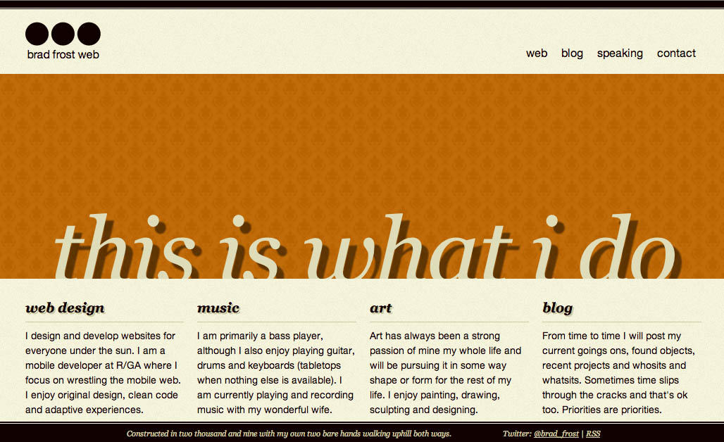

:target pseudo-selector to toggle the navigation. One unfortunate problem with it however is that Opera Mini doesn't update the URL with the anchor tag, so the navigation doesn't trigger. That's a bummer, but the super smart Tim Kadlec was able to find a way around it. I still need to solve it on my end, but it's good to know that there are ways of making it work. On larger screens the navigation fixes itself to the footer of the site. I'm normally not a fan of fixed positioned elements, but a relatively narrow band at the bottom of the screen didn't seem too invasive. And coincidentally, Luke published Responsive Navigation: Optimizing for Touch Across Devices that says that a fixed footer is actually good placement for navigation on all these emerging large screen touch devices. I could say "Oh yeah of course that's what I was going for the whole time", but I'd be lying. It's purely coincidence, but it's good to know that the placement isn't totally crazy. Performance I've been recently talking about performance as design, so keeping the site lightweight certainly influenced my design decisions. This design has two background images. The homepage weighs 29.87KB. The goal was to get away with doing as little as possible. If I need to add more later, I can. I still have a lot of performance-related tasks I still need to do, but it's off to a decent start. Development This was my first site really going to town with Sass. I made ample use of nested media queries, which helped keep me in one place instead of sifting through a style sheet figuring out where I defined what. I also just got Coda 2, which adds nice syntax highlighting, autocomplete for Sass variables and other really nice stuff. I also started using Sparkbox's Scss Rem Mixin Now With a Better Fallback in order to use rems but still fall back to relative units if rems aren't supported. I also used this site as an opportunity to restructure my CSS. I really enjoy Harry Robert's CSS Guidelines and tried to do a better job documenting my CSS. It proved to be tremendously beneficial. Oh, and Javascript on the site? There is none. That will probably change, but I think that's pretty crazy. Onwards This is just the beginning. I've got a lot of work to do to get things where I want them to be, but I feel I have a simple, solid foundation that I can build upon. And that's probably the biggest advice I can give. Start small and chip away at things when you get a little time. Don't feel you need to bite off everything at once.
*[DETAILS]: Device, Environment, Time, Activity, Individual, Location, Social