Designing an Effective Donate Form
Brad Frost Designing an Effective Donate FormI reached out to the Pittsburgh Food Bank last year about helping them redesign their website largely because I was having a hard time figuring out how to give them money.
So as part of our redesign of the Pittsburgh Food Bank's website, we want to make the donate experience more visible and usable.
We're still working hard to finish up the form design along with the rest of the site, but wanted to share some of the things we're considering as we design the donate form:
- Be visible
- Cut out the noise
- Break big tasks into smaller steps
- Use button styling for input
- Provide smart defaults and suggestions
- Articulate impact
- Inline validation
- Use proper input types
- Reduce the number of taps
- Automatically generate city and state info
- Use single-field credit card input pattern
Be visible
We're including the donate form above the footer on almost every page of the site. There's still a dedicated donate page, but by including the donate functionality on each page we're hoping users will be inspired to donate after reading about the Food Bank's many wonderful initiatives.
Cut out the noise
It's important to create an interface that helps users focus on the task at hand. For key tasks, such as a donate form or an e-commerce checkout form, it's often a good idea to remove superfluous elements that can distract users. Including a simplified header and footer (a la Amazon's checkout) and removing sidebars and other auxiliary content will help users accomplish the task faster.
Break big tasks into smaller steps
Another way to cut out the noise and help users focus is to break the form into smaller chunks. This reduces the cognitive load on the user, and also presents a much less intimidating form than exposing all fields at once.
Expectations impact conversion. pic.twitter.com/cXx9EpjVzu
— Luke Wroblewski (@lukew) June 6, 2014Use button styling for input
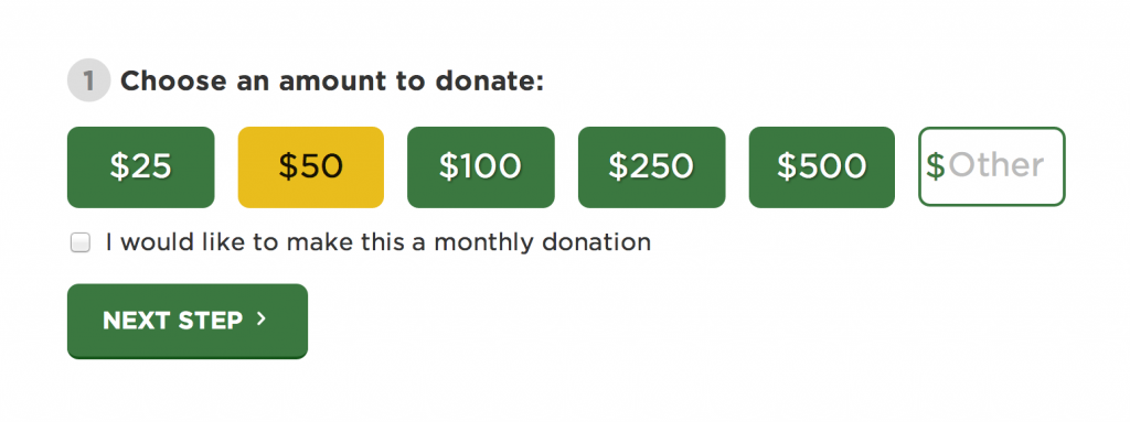
Visually speaking, buttons are more approachable, more tap-friendly, quicker, and more visually appealing than a select menu, traditional input or radio button. We're using button styling for the donation amount, with an optional input field if the user wants to donate a custom amount.
Button inputs: useful alternative to typing & drop-down menus on mobile. pic.twitter.com/aEcjHD3gUW
— Luke Wroblewski (@lukew) July 8, 2014Provide smart defaults and suggestions
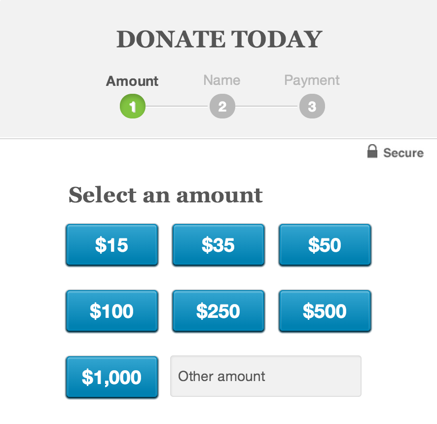
Many people (myself included) don't know what a typical and appropriate donation to a food bank looks like. By providing some representative suggestions, we're able to guide the user into the appropriate bucket. Barack Obama's campaign donate form provides a series of button selections for common donation values:
On the food bank's donate form, we're also pre-selecting a reasonable value to guide users into donating a worthwhile amount.
Articulate impact

It helps for people to know the impact of their donation. Right now we have simple (placeholder) messaging that helps users understand how far their donation will go. We're still working on the messaging and display of this info, but it will certainly help create a connection between the financial donation and the real impact it will have to alleviate hunger.
Inline Validation
There's nothing worse than submitting a massive form only to be scolded to go fishing to find your erroneous fields. Inline validation can help users fix their problems while they're still focused on the general area. We're using the wonderful Parsley library to validate our inputs as users exit fields.
Reduce the number of taps
An important overall goal of a form is to reduce as much as humanly possible. The less work the user has to do the more likely they are to complete the form. Simple things like combining fields like "First Name" and "Last Name" into a field simply called "Full Name" reduces the amount of taps the user has to endure.
It can always get even simpler. pic.twitter.com/eSa6RUE7gq
— Luke Wroblewski (@lukew) June 24, 2014User proper input types
Using the proper HTML5 input types and pattern attributes pulls up the appropriate virtual keyboard on mobile devices, saving users from having to manually switch over to enter a number.
Automatically generate city and state info

Surfacing the ZIP code field first allows us to automatically populate the city and state fields using a neat API called Ziptastic. This reduces the amount of fields the user has to fill out, and as a result increases their efficiency.
Faster address collection in forms. Research: http://t.co/xIrkmnyr77 pic.twitter.com/W2pVeKB6PS
— Luke Wroblewski (@lukew) August 15, 2014Use single-field credit card input pattern

We're using the single-field credit card input pattern to collect credit card information. This provides a more concise input method for entering credit card info, and testing data for this pattern is showing that users prefer it over a more traditional credit card input. So I'm excited to see how this plays out!
Work in Progress
The site isn't live yet, so it's still too early to tell whether the donate form will perform as well as we hope it will. A donation form is definitely a ripe place for some A/B testing, so it will be fun to experiment with over time.
If you have data, techniques, or anecdotes about web form design, I'd love to hear them. One of the benefits of designing in the open is that we're able incorporate feedback and new ideas back into our design before we launch.
For more info on form design, I'd recommend taking a look at these resources:
- Bad Donation Forms shows what to avoid when designing a donation form.
- Luke Wroblewski is a treasure trove of knowledge when it comes to form design, and his book on the subject is well worth your time.
- A Form of Madness from Mark Pilgrim
- 21 examples of effective web form design highlights some good form patterns