Single-Field Credit Card Input Pattern
Brad Frost Single-Field Credit Card Input Pattern
Forms suck. And they especially suck on mobile devices.
Luke Wroblewski has been talking for a long while now about how input masks make form entry a lot less painful for people. He recently highlighted Square Wallet's clever single-field credit card capture pattern.
The post referenced a phenomenal port of Square's native app behavior for the Web by Zachary Forrest (@zdfs).
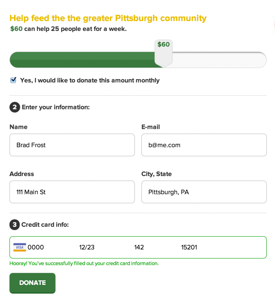
Zachary's excellent work was just what I needed to get started creating the Greater Pittsburgh Community Food Bank's donation form (as part of our open redesign of their site). I ended up tinkering with Zachary's initial script a bit and made a few alterations:
- Made the area a bit more fat-finger-friendly
- Added support for semantic form markup like
legendandlabel, so that if the environment doesn't cut the mustard, you can still provide users with a totally accessible, more traditional form experience. - Replaced the bitmap credit card icons with these wonderful SVG credit card icons from The Honest Ape. I ran them through Grumpicon so they appear as inline data URIs with PNG fallbacks for unsupported browsers.
- Added an additional instruction message below the field to provide additional messaging to the user. As much as I love this pattern as-is, I'm worried some folks might be confused/overwhelmed by all this shifting around. So I added a place to provide additional instructions to help users along as they fill out their credit card info.
You can see the pattern on Github, view a demo, or see it in action on our project's prototype.
I want to give a massive thank you to Zachary Forrest for putting together such a great script. I'm sure I'll be tweaking the entire donate experience over the course of the project, so if you'd like to contribute to the project we'd really appreciate it!