The Principles of Adaptive Design
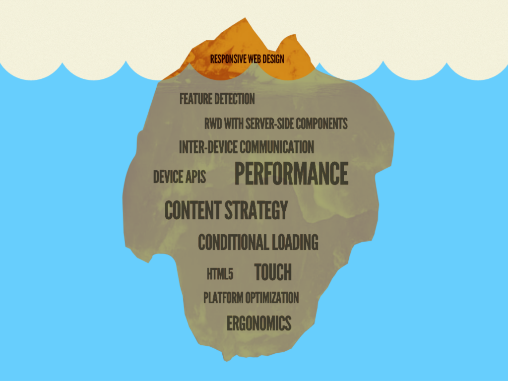
Brad Frost The Principles of Adaptive DesignThere's a conversation that crops up time to time again about the definition of responsive design and treating RWD as a goal unto itself. Has it evolved beyond Ethan Marcotte's original definition? There are so many articles out there on the subject already, but since it keeps coming up I figure it's still worth talking about. Of course there's a whole lot more to creating a great multi-device than fluid grids, flexible media, and media queries. The core tenets of responsive design are obviously important, and over the last few years they've helped the Web community better cope with the never-ending flood of Web-enabled devices. But those three ingredients are just the tip of the iceberg. 
- Ubiquity
- Flexibility
- Performance
- Enhancement
- Future-Friendly
Ubiquity The power of the Web is its ubiquity, and it's our responsibility as web designers to do our best to preserve the Web's biggest feature.
- Achieve content parity across devices, and avoid the myth of the mobile context.
- Understand the difference between "support" and "optimization".
- Be considerate and inclusive as much as humanly possible.
Flexibility There ain't no going back to the fixed-width days of yore. In order to create effective designs for our multi-device age, we must embrace the Web's intrinsic fluidity.
- Create device-agnostic interfaces that aim to look and function beautifully everywhere on the resolution spectrum.
- Let content determine breakpoints instead of using today's popular device dimensions.
- Don't just create myopic buckets ("phone", "tablet", and "desktop"). Rather consider the entire resolution spectrum and all the devices–both present and future–that will access your experience.
- Use tools that encourage flexibility
Performance The first few years of our responsive age were spent getting our heads around the mechanics of media queries and other techniques. All the while the size of average Web page–responsive or not–skyrocketed in size. So it's been a welcome change to see more folks care about performance and tackle the performance-related issues of the multi-device Web.
-
Treat performance as design and help your organization prioritize performance.
-
Set performance budgets and stick to them.
-
Embrace conditional loading, as this crucial technique helps us deliver highly-performant and fully-featured experiences to our users.
-
Get into the browser sooner and test early and often. Performance is invisible, so testing is essential to help us catch performance-hurting decisions. Enhancement Responsive web design does not need to stop at making squishy layouts. This isn't a one-size-fits-all solution. Responsive design is very much an extension of progressive enhancement, so don't get hung up thinking that media queries are the only tool in your toolbox.
-
Recognize that the Web is a continuum, not a platform.
-
Use feature detection to capitalize on device/browser capabilities so that we can support more devices while still optimizing for the the best of the best
-
Recognize that many interface patterns (From social widgets to images to maps to lightboxes) require more than simple translation in order to work well across all screens.
-
Read Adaptive Web Design by Aaron Gustafson and apply those principles and techniques in your work.
Future Friendly No one knows what the Web and device landscape is going to look like in a couple years, but there’s a damn good chance the gadgets sitting underneath Christmas trees a few years from now will have access to the Web.
- The key aspect of future-friendly thinking is to acknowledge and embrace unpredictability.
- Think in a future-friendly way by focusing on what really matters, creating portable data, and getting your content ready to go anywhere.
- Be present friendly. As Josh Clark says, “When it comes to the Web, the more backward-compatible you are, the more forward-compatible you’re likely to be.”
Guiding Principles I like these principles. For me, they serve as a sort of checklist for any strategic, design, or development decision. If decisions go against one or more of these principles, we need to have a conversation. 